How to make beautiful data visualizations in Python with matplotlib
Published on June 28, 2014 by Dr. Randal S. Olson
graphic design matplotlib python tutorial visualization
14 min READ
Want to learn more about data visualization with Python?
Take a look at my Data Visualization Basics with Python video course on O'Reilly.
It's been well over a year since I wrote my last tutorial, so I figure I'm overdue. This time, I'm going to focus on how you can make beautiful data visualizations in Python with matplotlib.
There are already tons of tutorials on how to make basic plots in matplotlib. There's even a huge example plot gallery right on the matplotlib web site, so I'm not going to bother covering the basics here. However, one aspect that's missing in all of these tutorials and examples is how to make a nice-looking plot.
Below, I'm going to outline the basics of effective graphic design and show you how it's done in matplotlib. I'll note that these tips aren't limited to matplotlib; they apply just as much in R/ggplot2, matlab, Excel, and any other graphing tool you use.
Less is more
The most important tip to learn here is that when it comes to plotting, less is more. Novice graphical designers often make the mistake of thinking that adding a cute semi-related picture to the background of a data visualization will make it more visually appealing. (Yes, that graphic was an official release from the CDC.) Or perhaps they'll fall prey to more subtle graphic design flaws, such as using an excess of chartjunk that their graphing tool includes by default.
At the end of the day, data looks better naked. Spend more time stripping your data down than dressing it up. Darkhorse Analytics made an excellent GIF to explain the point:
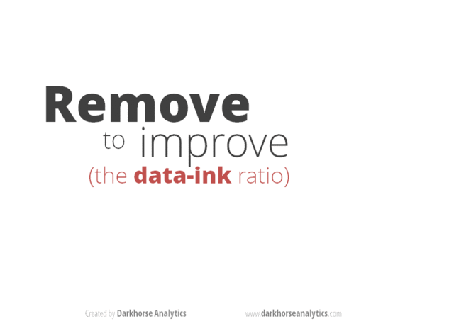
(click on the GIF for a gfycat version that allows you to move through it at your own pace)
Antoine de Saint-Exupery put it best:
Perfection is achieved not when there is nothing more to add, but when there is nothing left to take away.
You'll see this in the spirit of all of my plots below.
Color matters
The default color scheme in matplotlib is pretty ugly. Die-hard matlab/matplotlib fans may stand by their color scheme to the end, but it's undeniable that Tableau's default color scheme is orders of magnitude better than matplotlib's.
Use established default color schemes from software that is well-known for producing beautiful plots. Tableau has an excellent set of color schemes to use, ranging from grayscale to colored to color blind-friendly. Which brings me to my next point...
Many graphic designers completely forget about color blindness, which affects over 5% of the viewers of their graphics. For example, a plot using red and green to differentiate two categories of data is going to be completely incomprehensible for anyone with red-green color blindness. Whenever possible, stick to using color blind-friendly color schemes, such as Tableau's "Color Blind 10."
Required libraries
You'll need the following Python libraries installed to run this code:
- matplotlib
- pandas
The Anaconda Python distribution provides an easy double-click installer that includes all of the libraries you'll need.
Blah, blah, blah... let's get to the code
Now that we've covered the basics of graphic design, let's dive into the code. I'll explain the "what" and "why" of each line of code with inline comments.
Line plots
import matplotlib.pyplot as plt
import pandas as pd
# Read the data into a pandas DataFrame.
gender_degree_data = pd.read_csv("http://www.randalolson.com/assets/2014/06/percent-bachelors-degrees-women-usa.csv")
# These are the "Tableau 20" colors as RGB.
tableau20 = [(31, 119, 180), (174, 199, 232), (255, 127, 14), (255, 187, 120),
(44, 160, 44), (152, 223, 138), (214, 39, 40), (255, 152, 150),
(148, 103, 189), (197, 176, 213), (140, 86, 75), (196, 156, 148),
(227, 119, 194), (247, 182, 210), (127, 127, 127), (199, 199, 199),
(188, 189, 34), (219, 219, 141), (23, 190, 207), (158, 218, 229)]
# Scale the RGB values to the [0, 1] range, which is the format matplotlib accepts.
for i in range(len(tableau20)):
r, g, b = tableau20[i]
tableau20[i] = (r / 255., g / 255., b / 255.)
# You typically want your plot to be ~1.33x wider than tall. This plot is a rare
# exception because of the number of lines being plotted on it.
# Common sizes: (10, 7.5) and (12, 9)
plt.figure(figsize=(12, 14))
# Remove the plot frame lines. They are unnecessary chartjunk.
ax = plt.subplot(111)
ax.spines["top"].set_visible(False)
ax.spines["bottom"].set_visible(False)
ax.spines["right"].set_visible(False)
ax.spines["left"].set_visible(False)
# Ensure that the axis ticks only show up on the bottom and left of the plot.
# Ticks on the right and top of the plot are generally unnecessary chartjunk.
ax.get_xaxis().tick_bottom()
ax.get_yaxis().tick_left()
# Limit the range of the plot to only where the data is.
# Avoid unnecessary whitespace.
plt.ylim(0, 90)
plt.xlim(1968, 2014)
# Make sure your axis ticks are large enough to be easily read.
# You don't want your viewers squinting to read your plot.
plt.yticks(range(0, 91, 10), [str(x) + "%" for x in range(0, 91, 10)], fontsize=14)
plt.xticks(fontsize=14)
# Provide tick lines across the plot to help your viewers trace along
# the axis ticks. Make sure that the lines are light and small so they
# don't obscure the primary data lines.
for y in range(10, 91, 10):
plt.plot(range(1968, 2012), [y] * len(range(1968, 2012)), "--", lw=0.5, color="black", alpha=0.3)
# Remove the tick marks; they are unnecessary with the tick lines we just plotted.
plt.tick_params(axis="both", which="both", bottom="off", top="off",
labelbottom="on", left="off", right="off", labelleft="on")
# Now that the plot is prepared, it's time to actually plot the data!
# Note that I plotted the majors in order of the highest % in the final year.
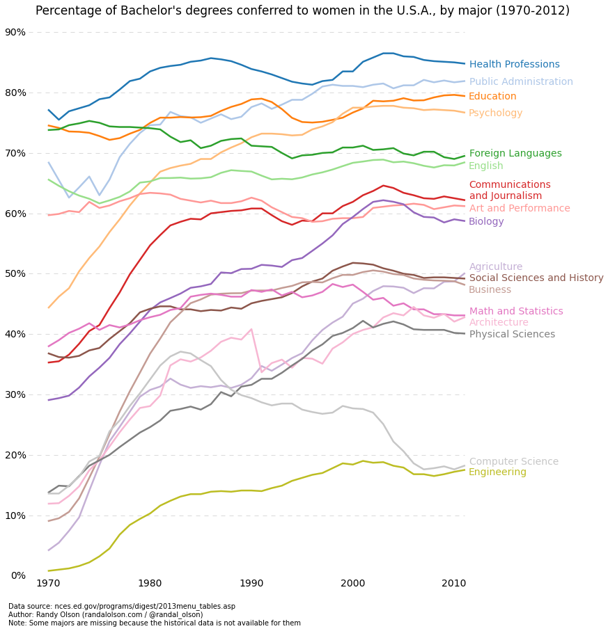
majors = ['Health Professions', 'Public Administration', 'Education', 'Psychology',
'Foreign Languages', 'English', 'Communications\nand Journalism',
'Art and Performance', 'Biology', 'Agriculture',
'Social Sciences and History', 'Business', 'Math and Statistics',
'Architecture', 'Physical Sciences', 'Computer Science',
'Engineering']
for rank, column in enumerate(majors):
# Plot each line separately with its own color, using the Tableau 20
# color set in order.
plt.plot(gender_degree_data.Year.values,
gender_degree_data[column.replace("\n", " ")].values,
lw=2.5, color=tableau20[rank])
# Add a text label to the right end of every line. Most of the code below
# is adding specific offsets y position because some labels overlapped.
y_pos = gender_degree_data[column.replace("\n", " ")].values[-1] - 0.5
if column == "Foreign Languages":
y_pos += 0.5
elif column == "English":
y_pos -= 0.5
elif column == "Communications\nand Journalism":
y_pos += 0.75
elif column == "Art and Performance":
y_pos -= 0.25
elif column == "Agriculture":
y_pos += 1.25
elif column == "Social Sciences and History":
y_pos += 0.25
elif column == "Business":
y_pos -= 0.75
elif column == "Math and Statistics":
y_pos += 0.75
elif column == "Architecture":
y_pos -= 0.75
elif column == "Computer Science":
y_pos += 0.75
elif column == "Engineering":
y_pos -= 0.25
# Again, make sure that all labels are large enough to be easily read
# by the viewer.
plt.text(2011.5, y_pos, column, fontsize=14, color=tableau20[rank])
# matplotlib's title() call centers the title on the plot, but not the graph,
# so I used the text() call to customize where the title goes.
# Make the title big enough so it spans the entire plot, but don't make it
# so big that it requires two lines to show.
# Note that if the title is descriptive enough, it is unnecessary to include
# axis labels; they are self-evident, in this plot's case.
plt.text(1995, 93, "Percentage of Bachelor's degrees conferred to women in the U.S.A."
", by major (1970-2012)", fontsize=17, ha="center")
# Always include your data source(s) and copyright notice! And for your
# data sources, tell your viewers exactly where the data came from,
# preferably with a direct link to the data. Just telling your viewers
# that you used data from the "U.S. Census Bureau" is completely useless:
# the U.S. Census Bureau provides all kinds of data, so how are your
# viewers supposed to know which data set you used?
plt.text(1966, -8, "Data source: nces.ed.gov/programs/digest/2013menu_tables.asp"
"\nAuthor: Randy Olson (randalolson.com / @randal_olson)"
"\nNote: Some majors are missing because the historical data "
"is not available for them", fontsize=10)
# Finally, save the figure as a PNG.
# You can also save it as a PDF, JPEG, etc.
# Just change the file extension in this call.
# bbox_inches="tight" removes all the extra whitespace on the edges of your plot.
plt.savefig("percent-bachelors-degrees-women-usa.png", bbox_inches="tight")
Line plots with error bars
import pandas as pd
import matplotlib.pyplot as plt
from scipy.stats import sem
# This function takes an array of numbers and smoothes them out.
# Smoothing is useful for making plots a little easier to read.
def sliding_mean(data_array, window=5):
data_array = array(data_array)
new_list = []
for i in range(len(data_array)):
indices = range(max(i - window + 1, 0),
min(i + window + 1, len(data_array)))
avg = 0
for j in indices:
avg += data_array[j]
avg /= float(len(indices))
new_list.append(avg)
return array(new_list)
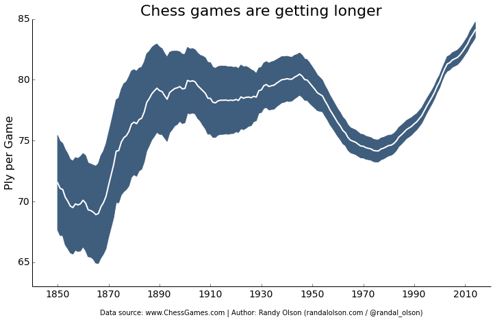
# Due to an agreement with the ChessGames.com admin, I cannot make the data
# for this plot publicly available. This function reads in and parses the
# chess data set into a tabulated pandas DataFrame.
chess_data = read_chess_data()
# These variables are where we put the years (x-axis), means (y-axis), and error bar values.
# We could just as easily replace the means with medians,
# and standard errors (SEMs) with standard deviations (STDs).
years = chess_data.groupby("Year").PlyCount.mean().keys()
mean_PlyCount = sliding_mean(chess_data.groupby("Year").PlyCount.mean().values,
window=10)
sem_PlyCount = sliding_mean(chess_data.groupby("Year").PlyCount.apply(sem).mul(1.96).values,
window=10)
# You typically want your plot to be ~1.33x wider than tall.
# Common sizes: (10, 7.5) and (12, 9)
plt.figure(figsize=(12, 9))
# Remove the plot frame lines. They are unnecessary chartjunk.
ax = plt.subplot(111)
ax.spines["top"].set_visible(False)
ax.spines["right"].set_visible(False)
# Ensure that the axis ticks only show up on the bottom and left of the plot.
# Ticks on the right and top of the plot are generally unnecessary chartjunk.
ax.get_xaxis().tick_bottom()
ax.get_yaxis().tick_left()
# Limit the range of the plot to only where the data is.
# Avoid unnecessary whitespace.
plt.ylim(63, 85)
# Make sure your axis ticks are large enough to be easily read.
# You don't want your viewers squinting to read your plot.
plt.xticks(range(1850, 2011, 20), fontsize=14)
plt.yticks(range(65, 86, 5), fontsize=14)
# Along the same vein, make sure your axis labels are large
# enough to be easily read as well. Make them slightly larger
# than your axis tick labels so they stand out.
plt.ylabel("Ply per Game", fontsize=16)
# Use matplotlib's fill_between() call to create error bars.
# Use the dark blue "#3F5D7D" as a nice fill color.
plt.fill_between(years, mean_PlyCount - sem_PlyCount,
mean_PlyCount + sem_PlyCount, color="#3F5D7D")
# Plot the means as a white line in between the error bars.
# White stands out best against the dark blue.
plt.plot(years, mean_PlyCount, color="white", lw=2)
# Make the title big enough so it spans the entire plot, but don't make it
# so big that it requires two lines to show.
plt.title("Chess games are getting longer", fontsize=22)
# Always include your data source(s) and copyright notice! And for your
# data sources, tell your viewers exactly where the data came from,
# preferably with a direct link to the data. Just telling your viewers
# that you used data from the "U.S. Census Bureau" is completely useless:
# the U.S. Census Bureau provides all kinds of data, so how are your
# viewers supposed to know which data set you used?
plt.xlabel("\nData source: www.ChessGames.com | "
"Author: Randy Olson (randalolson.com / @randal_olson)", fontsize=10)
# Finally, save the figure as a PNG.
# You can also save it as a PDF, JPEG, etc.
# Just change the file extension in this call.
# bbox_inches="tight" removes all the extra whitespace on the edges of your plot.
plt.savefig("chess-number-ply-over-time.png", bbox_inches="tight");
Histograms
import pandas as pd
import matplotlib.pyplot as plt
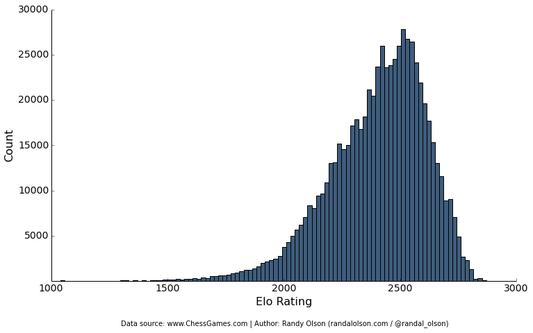
# Due to an agreement with the ChessGames.com admin, I cannot make the data
# for this plot publicly available. This function reads in and parses the
# chess data set into a tabulated pandas DataFrame.
chess_data = read_chess_data()
# You typically want your plot to be ~1.33x wider than tall.
# Common sizes: (10, 7.5) and (12, 9)
plt.figure(figsize=(12, 9))
# Remove the plot frame lines. They are unnecessary chartjunk.
ax = plt.subplot(111)
ax.spines["top"].set_visible(False)
ax.spines["right"].set_visible(False)
# Ensure that the axis ticks only show up on the bottom and left of the plot.
# Ticks on the right and top of the plot are generally unnecessary chartjunk.
ax.get_xaxis().tick_bottom()
ax.get_yaxis().tick_left()
# Make sure your axis ticks are large enough to be easily read.
# You don't want your viewers squinting to read your plot.
plt.xticks(fontsize=14)
plt.yticks(range(5000, 30001, 5000), fontsize=14)
# Along the same vein, make sure your axis labels are large
# enough to be easily read as well. Make them slightly larger
# than your axis tick labels so they stand out.
plt.xlabel("Elo Rating", fontsize=16)
plt.ylabel("Count", fontsize=16)
# Plot the histogram. Note that all I'm passing here is a list of numbers.
# matplotlib automatically counts and bins the frequencies for us.
# "#3F5D7D" is the nice dark blue color.
# Make sure the data is sorted into enough bins so you can see the distribution.
plt.hist(list(chess_data.WhiteElo.values) + list(chess_data.BlackElo.values),
color="#3F5D7D", bins=100)
# Always include your data source(s) and copyright notice! And for your
# data sources, tell your viewers exactly where the data came from,
# preferably with a direct link to the data. Just telling your viewers
# that you used data from the "U.S. Census Bureau" is completely useless:
# the U.S. Census Bureau provides all kinds of data, so how are your
# viewers supposed to know which data set you used?
plt.text(1300, -5000, "Data source: www.ChessGames.com | "
"Author: Randy Olson (randalolson.com / @randal_olson)", fontsize=10)
# Finally, save the figure as a PNG.
# You can also save it as a PDF, JPEG, etc.
# Just change the file extension in this call.
# bbox_inches="tight" removes all the extra whitespace on the edges of your plot.
plt.savefig("chess-elo-rating-distribution.png", bbox_inches="tight");
Easy interactives
As an added bonus, thanks to plot.ly, it only takes one more line of code to turn your matplotlib plot into an interactive.
More Python plotting libraries
In this tutorial, I focused on making data visualizations with only Python's basic matplotlib library. If you don't feel like tweaking the plots yourself and want the library to produce better-looking plots on its own, check out the following libraries.
- Seaborn for statistical charts
- ggplot2 for Python
- prettyplotlib
- Bokeh for interactive charts
Recommended reading
Edward Tufte has been a pioneer of the "simple, effective plots" approach. Most of the graphic design of my visualizations has been inspired by reading his books.
The Visual Display of Quantitative Information is a classic book filled with plenty of graphical examples that everyone who wants to create beautiful data visualizations should read.
Envisioning Information is an excellent follow-up to the first book, again with a plethora of beautiful graphical examples.
There are plenty of other books out there about beautiful graphical design, but the two books above are the ones I found the most educational and inspiring.
If you liked what you saw in this post and want to learn more, check out my Python data visualization video course that I made in collaboration with O'Reilly. In just one hour, I will cover these topics and much more, which will provide you with a strong starting point for your career in data visualization.