The New York Times weather chart redux
Published on August 14, 2015 by Dr. Randal S. Olson
New York Times reproducibility weather
3 min READ
One of my favorite pastimes is recreating and updating old New York Times graphics. It's great practice decomposing graphs into reproducible elements, and I always learn a ton about good graphic design in the process. If you're still learning data visualization yourself, I highly recommend doing the same.
Last month, I updated the famous New York Times weather chart and was fortunate enough to contribute it to FiveThirtyEight. In this post, I'm going to briefly go over the process of how I made these charts. You can find all of the data and code for the FiveThirtyEight article on GitHub here.
The first step is to find some up-to-date weather data. There's plenty of data sources out there for historical weather data, but I decided to focus on Wunderground.com because their historical weather pages are quite easy to parse.
In the GitHub repository I linked above, there are two Python scripts: a scraper and a parser. The scraper downloads the web pages containing historical weather data for the weather station we point it at, while the parser uses BeautifulSoup to efficiently parse the HTML and transform the web pages into a flat CSV file.
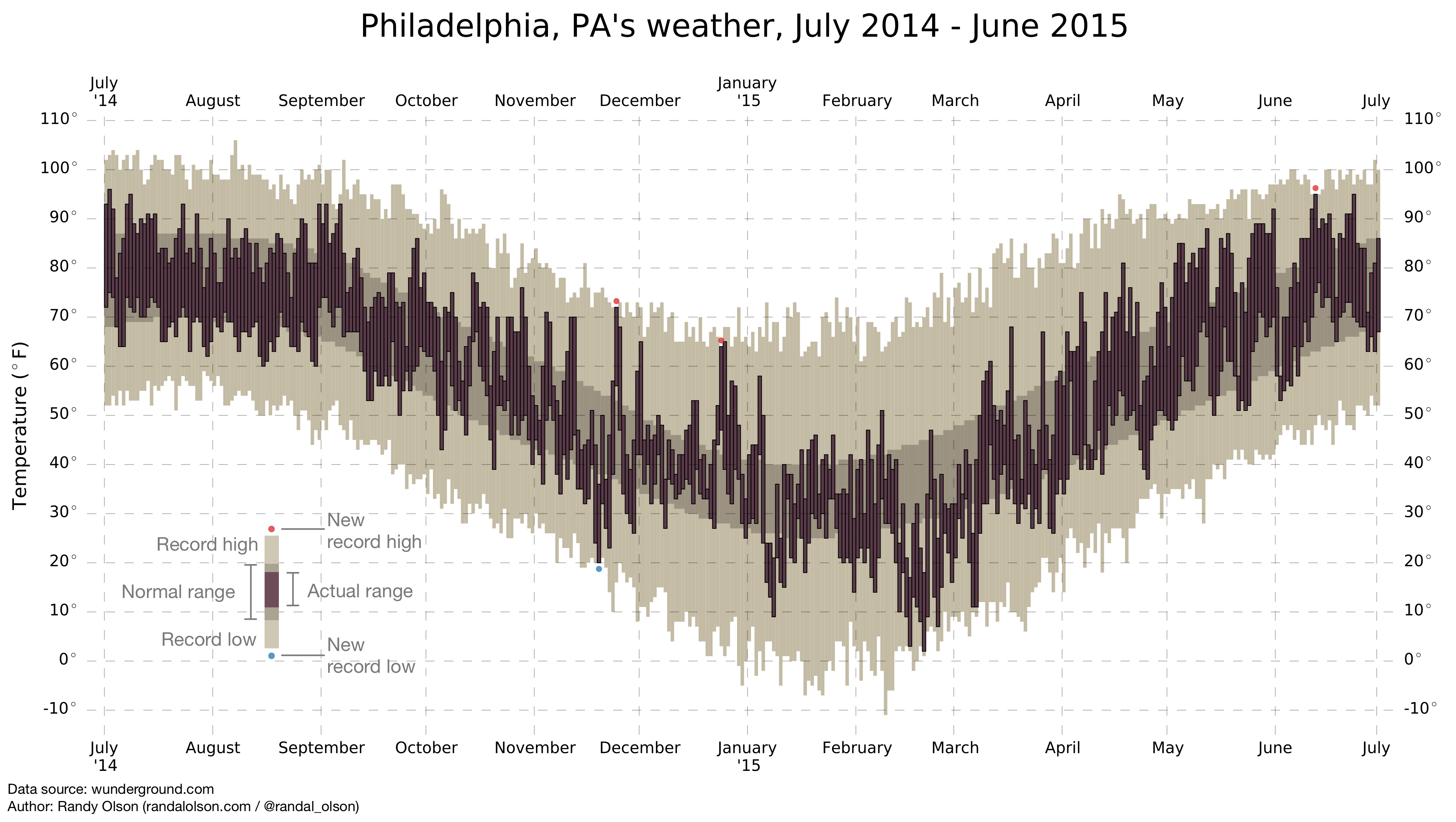
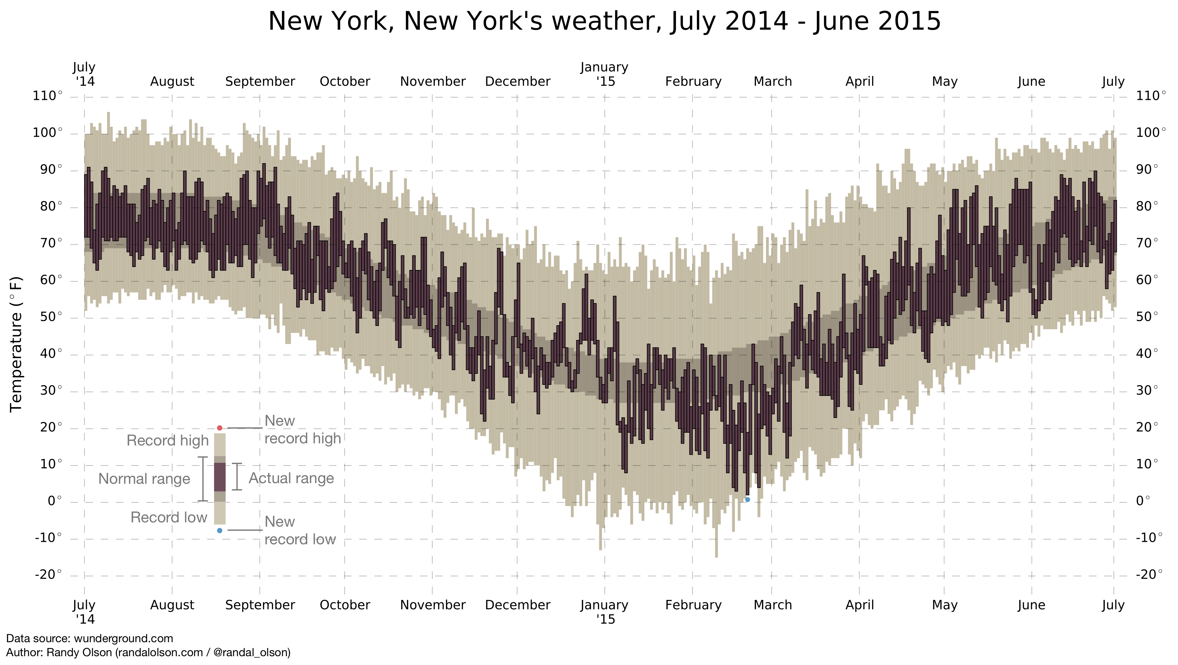
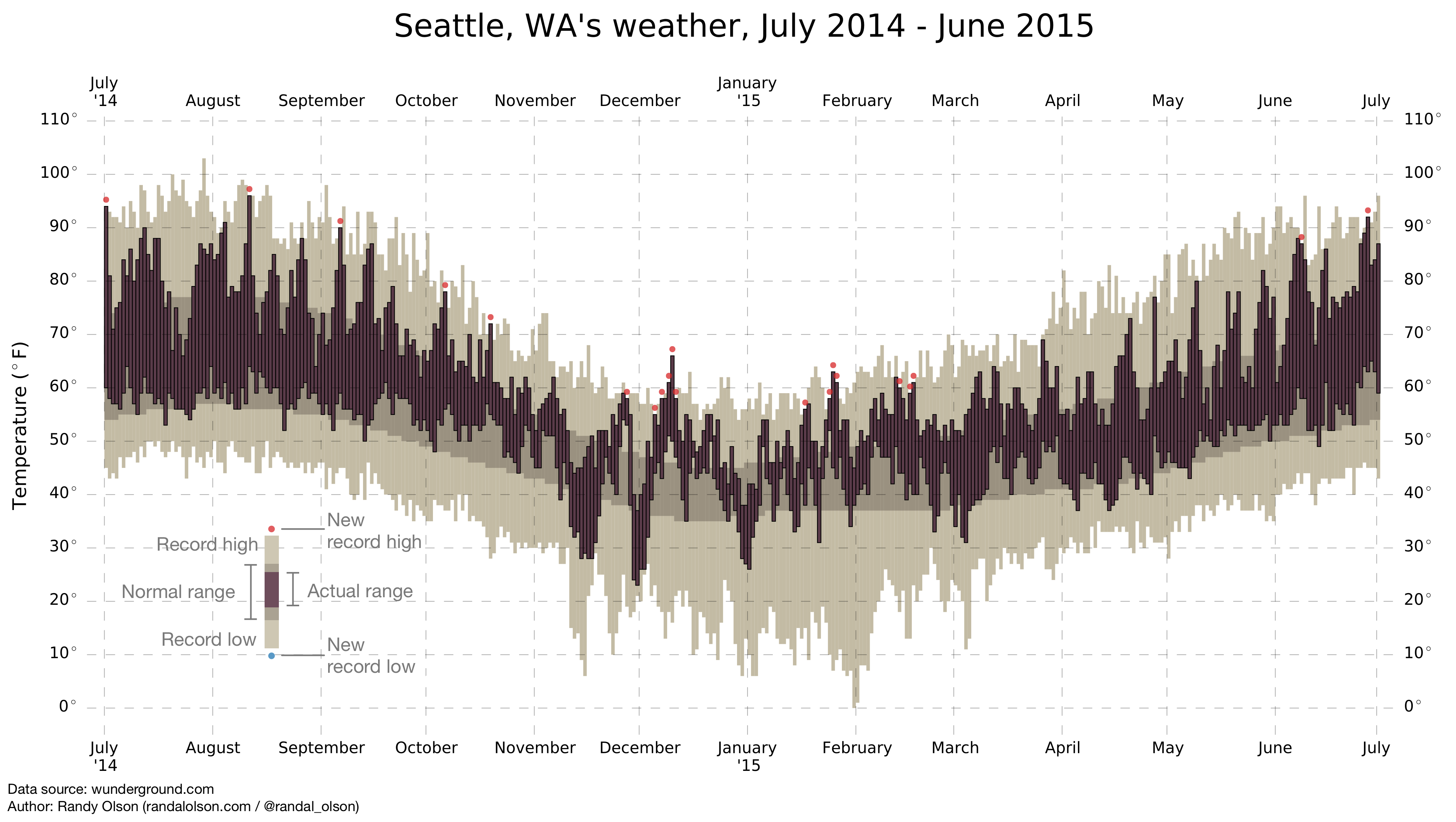
With the up-to-date weather data in hand, we can now turn to the design of the weather chart. The key point to reproducing the New York Times weather chart is realizing that it's just a bar chart, where every day is represented by three bars:
- A bar representing the record historical high and low temperatures for the day,
- a bar representing the average of the historical high and low temperatures for the day,
- and a bar representing the actual high and low temperatures for the day.
Simple, right? All we have to do is draw three bars for every day, where the bar starts at the min and stops at the max. Since we have all of those values already, we can use a handful of lines of Python code to generate the chart.
The Python code may look a bit complicated, but it's just a bunch of custom formatting for the chart. The core of the chart is generated with the three plt.bar() calls.
To add something new to the weather chart, I added small red and blue dots to represent new (or tied) record high and low temperatures, respectively, for the year. These are small visual cues to quickly communicate when and how often the city is experiencing record temperatures without requiring much inspection from the user. Seattle, WA, for example, has had about 20 record hot days in the past year, which you can now quickly spot thanks to the numerous red dots.
In the Python code, this is only a couple plt.scatter() calls for the days where the actual high/low matches the record high/low temperature.
After that, I manually designed the legend in Omnigraffle since it was a bit tricky to generate programmatically. I'll leave that as a practice exercise if you're really looking to flex your matplotlib muscles.
Voilà! We now have a reproducible method to generate arbitrary weather charts for any weather station on Wunderground. Enjoy!
What are some other classic charts that you would like to see updated?