Small multiples vs. animated GIFs for showing changes in fertility rates over time
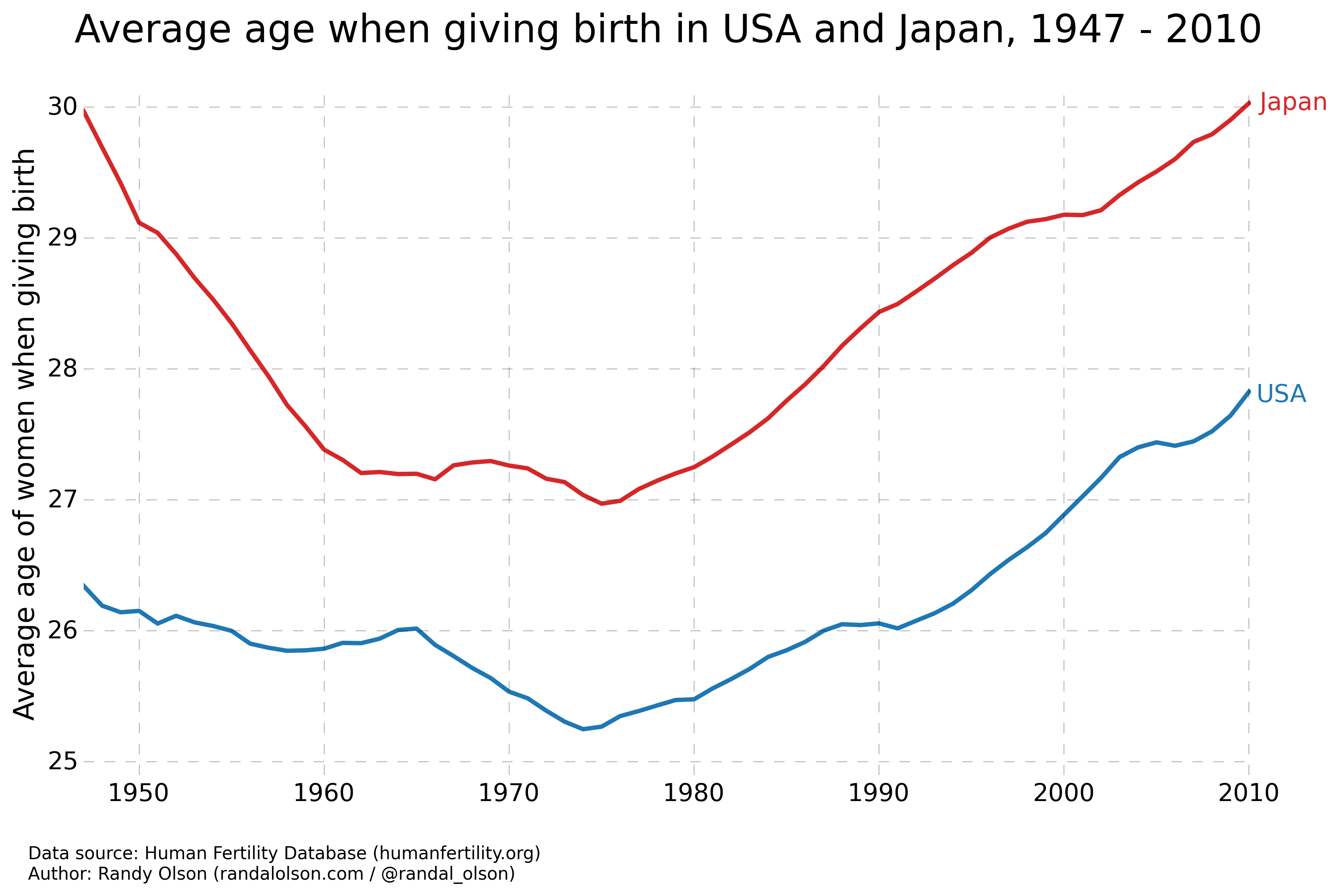
A couple weeks ago, Stephen Holzman shared an animated GIF on /r/DataIsBeautiful that caught my eye. The GIF showed the evolution of fertility rates of the U.S. and Japan between 1947 and 2010, which starts right in the middle of the post-WWII Baby Boom and follows the gradual decline of Japan's fertility rates, which has led to somewhat of a population crisis for Japan.
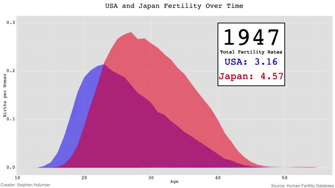
Although Stephen's GIF is fun to watch -- especially because the animation gives the appearance of waves rising and falling -- I couldn't help but be frustrated by the limitations of GIFs in data visualization. If we wanted to compare the fertility rates of 1980 and 2010, for example, we'd have to keep a mental snapshot of what the 1980 frame looked like for when the 2010 frame came around. Thus, comparisons of time points beyond a couple years are impossible with animated GIFs unless the viewer has photographic memory.
This drawback is the exact reason that small multiples were introduced to data visualization: If we're comparing the same data in the same format between several different [times|treatments|countries|etc.], then we can visualize the data on the same scale and axes to make them easily comparable.
I've long been a proponent of small multiples over GIFs, so I took Stephen's data (which is actually from the Human Fertility Database) and reworked it into small multiples. You can click on the image for a super-high-res version.
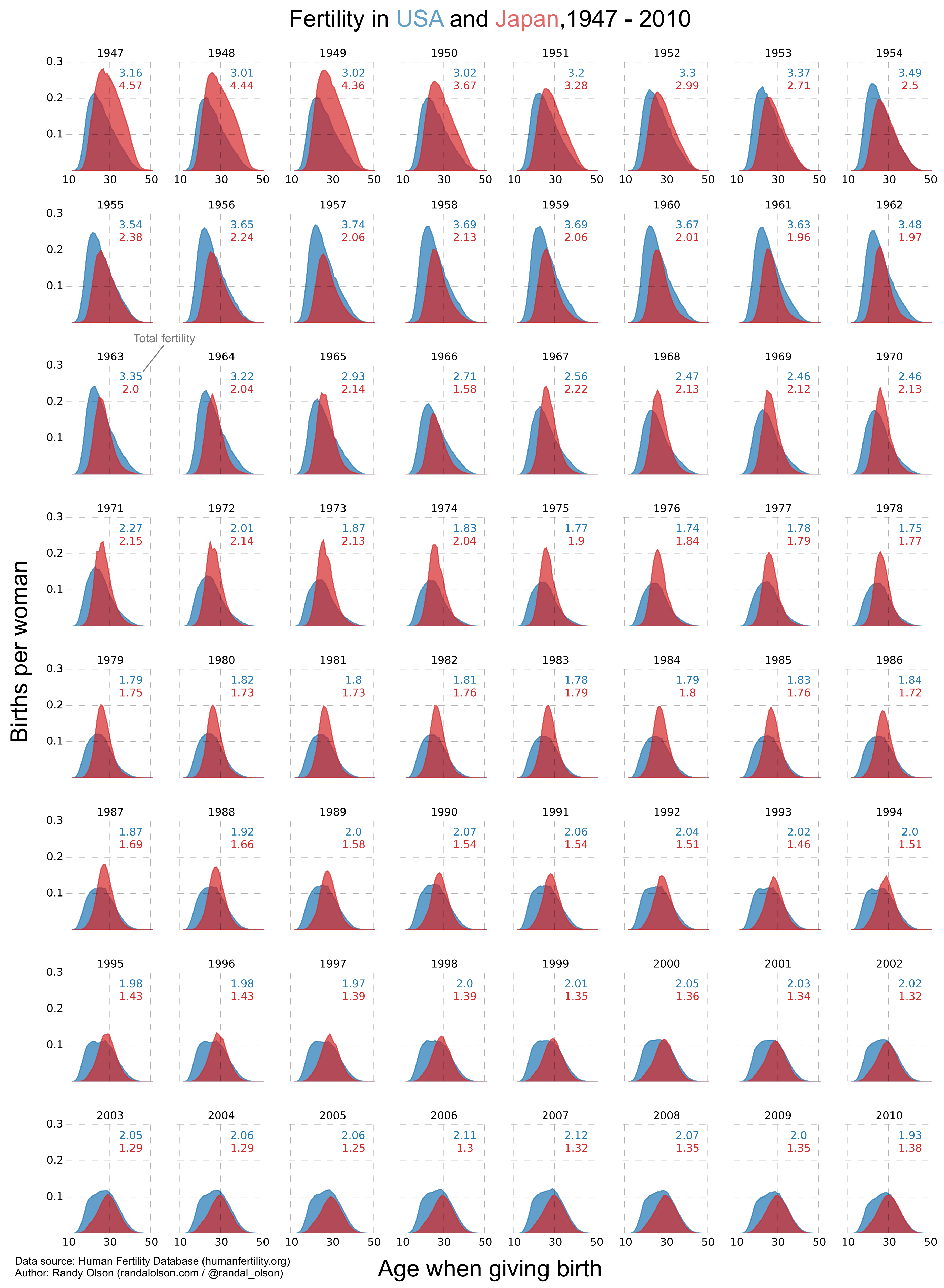
Each year gets its own plot -- running from left to right -- with both country's fertility rates plotted. The total fertility rate for each year is annotated onto its corresponding plot, and color-coded according to the country. I plotted the x-axis tick labels to show the reader the age range of the plots, but only on the top and bottom rows to avoid too much repetition. Similarly, the y-axis tick labels only appear on the plots on the left.
Of course, the drawback of small multiples is that we no longer see the data in the same detail as we did with the larger plots. Out of necessity, each plot in a small multiples chart must be small, simple, and have few axis ticks, which can make small multiples a poor choice if you're making a comparison where there has been little change.
We can compensate for this by subsetting the data. After all, 64 years is quite a lot of data to show in one graph. What if we just looked at every five years?
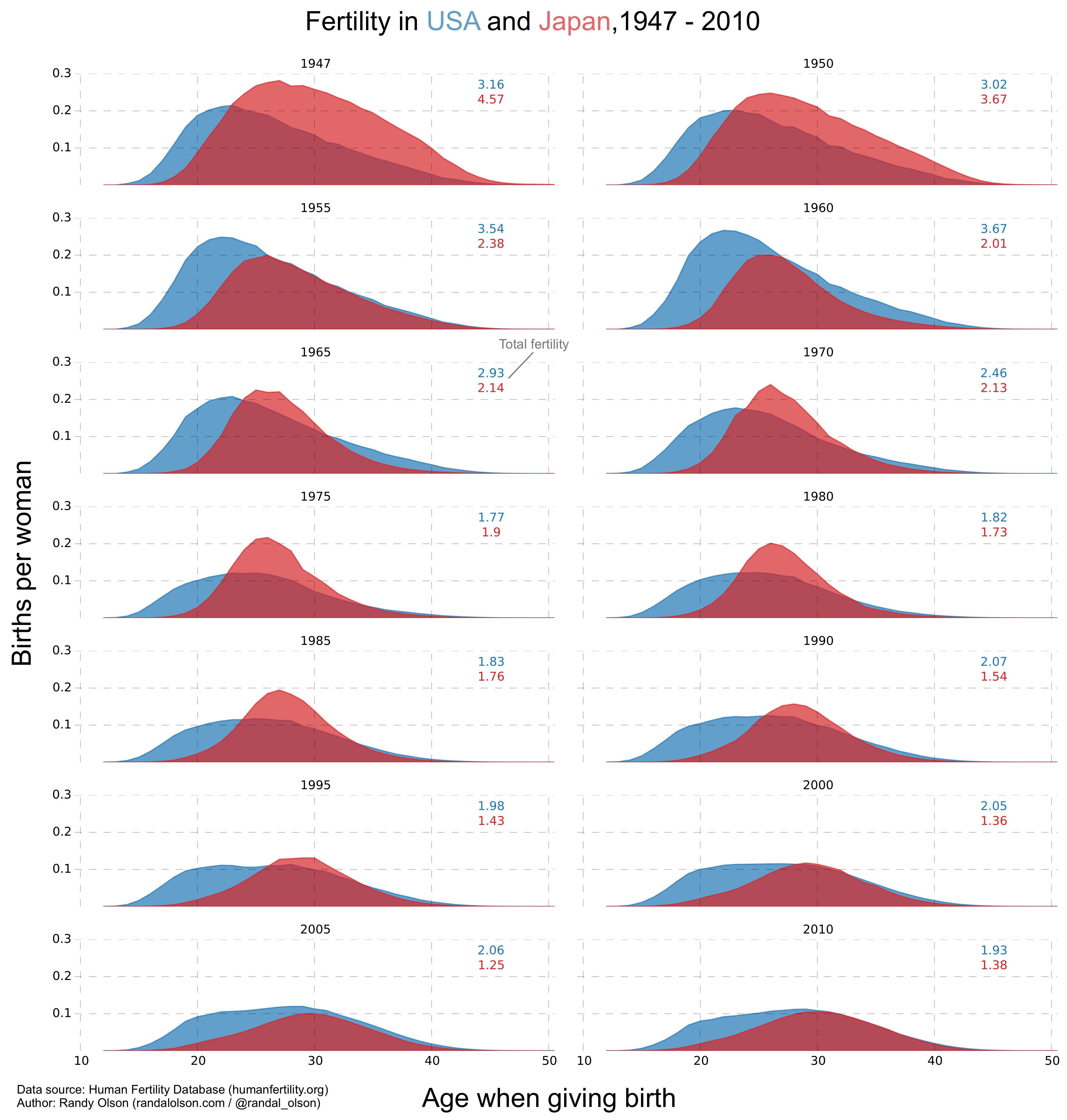
Now it's straightforward to compare across and within decades: 1947, 1955, 1965, etc. can easily be compared by looking down the column. By the same token, 1947 and 1950 can easily be compared by looking down the row. We still get about the same level of detail as the GIF, and maintain the overall trend of declining fertility rates in both countries as time goes on.
From this chart, two major trends that are readily apparent from the data:
1) Both the USA and Japan have experienced declining birth rates since the 1940s -- Japan moreso.
2) In the past 20 years, Japanese couples have started having children later in life (after their 30s) -- so much so that in 2010, half the children born were born to parents older than 30.
Which begs the question: Why show all this data if we only have two points to make?
Simplifying the charts even more
If the above two trends are all we wanted to show with the data, then we can simplify the charts even more by calculating summary statistics and plotting those instead.
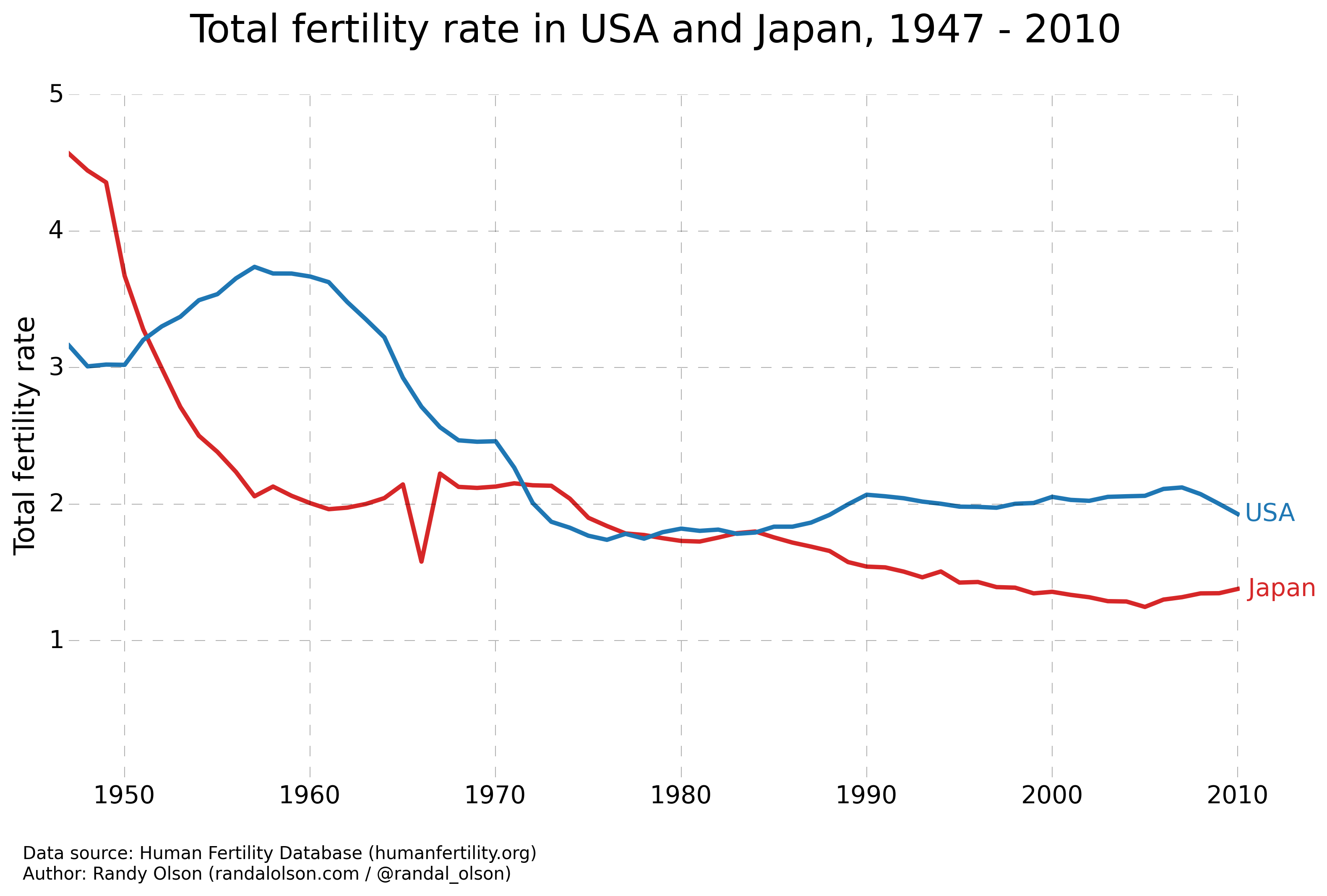
These charts take away the opportunity for the reader to glean any additional insights from the data. However, if we wanted to tell a straightforward story with charts, these would be the best ones to use.
Conclusions
- Animated GIFs, while flashy, often make it more difficult to gain insight from data.
- Static charts, such as small multiples, can simplify animated GIFs to make trends in the data more apparent.
- Sometimes it's better to calculate summary statistics and plot those instead, especially if showing all of the data does not lend additional insight.
If you liked what you saw in this post and want to learn more, check out my Python data visualization video course that I made in collaboration with O'Reilly. In just one hour, I will cover these topics and much more, which will provide you with a strong starting point for your career in data visualization.
Code for the small multiples visualization
I can't share the data that I used to create this visualization -- you'll have to download it from the Human Fertility Database -- but I've provided the Python code I used to generate the small multiples visualization below for education purposes.
Note that I had to add the plot axis labels, the plot title, and a couple annotations manually.
Tags

Dr. Randal S. Olson
AI Researcher & Builder · Co-Founder & CTO at Goodeye Labs
I turn ambitious AI ideas into business wins, bridging the gap between technical promise and real-world impact.