What data visualization tools do /r/DataIsBeautiful OC creators use?
One of the most common questions that newcomers to data [science/visualization/analysis] ask is: "What tools should I use to create data visualizations?" While I always recommend learning design principles before tools, I thought I'd take a stab at answering that question by analyzing what tools the /r/DataIsBeautiful community uses.
For the uninitiated, /r/DataIsBeautiful is an online community dedicated to data analysis and visualization, where people post and discuss various data visualizations from around the web. Sometimes /r/DataIsBeautiful community members create and share their own data visualizations -- called "OC," or Original Content -- which I have always found to be a great source of ideas and inspiration.
As part of the /r/DataIsBeautiful posting rules, every OC contributor must include a comment on their post describing the data source(s) and tool(s) they used to create their data visualization. Thus, analyzing their tool usage over the years was a fairly simple n-gram analysis of all comments made by OC contributors on /r/DataIsBeautiful that mention the word "tool." For this article, I analyzed thousands of comments made by OC contributors to /r/DataIsBeautiful between January 2014 and January 2016.
(Unfortunately, it was difficult to parse out mentions of the "R" language with the n-gram analysis, so we'll have to use ggplot2 as a proxy.)
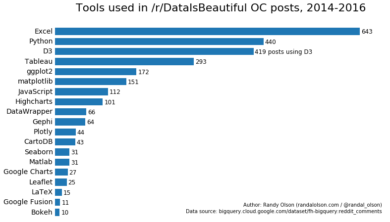
The most popular tools on /r/DataIsBeautiful are:
| Tool | Free? | Requires programming? | Typical uses |
| Excel | Paid | No | Basic data analysis and visualization |
| Python | Free | Yes | General-purpose scripting language that is typically used for data scraping, cleaning, and wrangling |
| D3.js | Free | Yes | JavaScript-based library for interactive data visualization on the web |
| Tableau | Paid, with limited free option | No | Advanced interactive data visualizations for the web |
| ggplot2 | Free | Yes | Advanced data visualization library for the R scripting language |
| R | Free | Yes | Scripting language designed for statistical analysis, modeling, and data visualization |
| matplotlib | Free | Yes | Python-based visualization library for making basic data visualizations |
As expected, Excel dominates the list as the primary tool that most beginners use: In this case, there have been at least 643 OC data visualizations on /r/DataIsBeautiful that were made with Excel. Excel is a great tool to start with, but you should eventually move on to more advanced tools that allow you to programmatically generate visualizations such as matplotlib/Seaborn, D3.js, or ggplot2. If programming isn't your forte, Tableau is a much better option than Excel.
Here's descriptions for the rest of the tools:
| Tool | Free? | Requires programming? | Typical uses |
| JavaScript | Free | Yes | Scripting language for the web |
| Highcharts | Free for non-commercial projects | Yes | JavaScript-based library for programmatically creating interactive data visualizations for the web; easier to use but less flexibility than D3.js |
| Datawrapper | Free | No | Basic online interactive visualizations |
| Gephi | Free | No | Network visualization |
| Plotly | Free | No | Web-based GUI for creating interactive data visualizations |
| CartoDB | Free (limited) | No | Web-based tool for creating interactive online maps |
| Seaborn | Free | Yes | Python-based visualization library for advanced statistical data visualization |
| Matlab | Paid | Yes | Powerful analysis, modeling, and data visualization tool |
| Google Charts | Free | Yes | Simple JavaScript-based visualization library for creating interactive online visualizations |
| Leaflet.js | Free | Yes | Simple JavaScript-based visualization library for creating interactive online map visualizations |
| LaTeX | Free | Yes | Document preparation system that it somehow used to create visualizations (???) |
| Google Fusion | Free | No | Web-based tool for creating interactive online data and map visualizations |
| Bokeh | Free | Yes | Python-based visualization library for creating interactive data and map visualizations |
I was also curious about temporal trends in library usage, so I grouped the tool mentions by year and plotted them below.
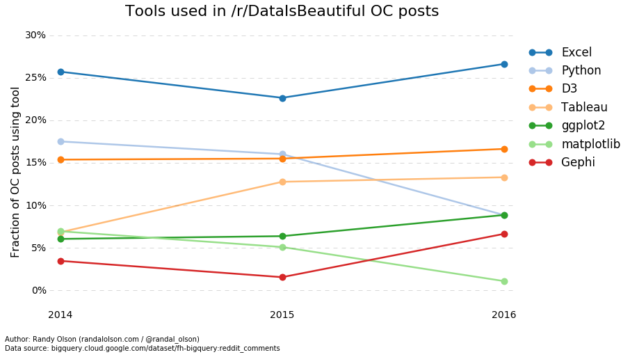
GUI-based visualization tools such as Tableau and Gephi are seeing steady growth, whereas Python and matplotlib (oddly) seem to be waning in relative popularity. D3.js and ggplot2 are similarly experiencing steady growth, although I should note that 2016's counts are only based on January 2016's comments and may change by the end of the year. We'll have to revisit these trends come 2017.
Hopefully that answers all of your data visualization tool-related questions! If you have any more questions or concerns, please leave them in the comments.
How to download the comments I analyzed
If you'd like to repeat this analysis yourself, run the following SQL statement on the Google BigQuery database.
SELECT
  body,
  created_utc
FROM
  [fh-bigquery:reddit_comments.2016_01],
  [fh-bigquery:reddit_comments.2015_12],
  [fh-bigquery:reddit_comments.2015_11],
  [fh-bigquery:reddit_comments.2015_10],
  [fh-bigquery:reddit_comments.2015_09],
  [fh-bigquery:reddit_comments.2015_08],
  [fh-bigquery:reddit_comments.2015_07],
  [fh-bigquery:reddit_comments.2015_06],
  [fh-bigquery:reddit_comments.2015_05],
  [fh-bigquery:reddit_comments.2015_04],
  [fh-bigquery:reddit_comments.2015_03],
  [fh-bigquery:reddit_comments.2015_02],
  [fh-bigquery:reddit_comments.2015_01],
  [fh-bigquery:reddit_comments.2014]
WHERE
  LOWER(BODY) LIKE "%tool%"
  AND subreddit == "dataisbeautiful"