Design critique: Putting Big Pharma spending in perspective
Recently, /r/DataIsBeautiful began hosting weekly visualization redesign competitions challenging everyone to come up with better and less misleading designs of existing graphics. Below is the first of many redesigns and detailed critiques that I will be working on.
In early 2015, John Oliver and his team released an excellent exposé on Big Pharma and their shady marketing tactics. Shortly thereafter, Leon Markovitz from dadaviz released the following bubble chart to feed the ensuing anti-Big Pharma news cycle.
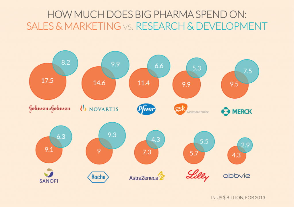
While this bubble chart visualizes an interesting phenomenon, several aspects of the chart can be improved to tell a more accurate and complete story. Below, I will outline and address three such improvements.
Better design through better chart choices
It has been shown time and time again that circles are terrible for making comparisons. Worse, the above bubble chart makes it even more difficult to use the circles to compare values by not even overlapping them. The visual representations of the data in this graphic are minimally useful, and most readers will simply rely on reading and comparing the numbers inside each circle, which renders the chart a fancy-looking data table.
Most basic guides for selecting charts recommend the use of bar charts for comparisons of data. Let's rework the above chart into a bar chart.
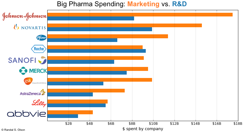
The bar chart works much better than the bubble chart for comparing the company's marketing and R&D budgets by placing them on the same axis. It also still allows the viewer to look up approximate budget numbers via the x-axis grid lines. However, the bar chart is also quite cluttered because it's comparing 2 values for 10 companies.
This is where it's important to think about the purpose of the chart. Leon wanted to use this chart to communicate the fact that "9 out of 10 Big Pharma companies spend more on marketing than R&D." This fact can more effectively be communicated by a scatter plot, as I've demonstrated below. In the chart below, each square represents a company.
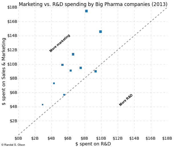
The key to this scatter plot is the line running diagonally through the center of the chart, which represents parity between marketing and R&D spending. Now the viewer can immediately tell how many Big Pharma companies spend more on marketing than R&D: They need only count the number of squares above and below the line of parity.
As an added advantage, the scatter plot still allows the viewer to gauge approximate budgets for each company and allows for a third dimension of data -- total company revenue in this case -- to be visualized via the size of the squares. Even though the identity of the individual companies are lost in the scatter plot, this issue could be remedied by annotating the graph with the names, changing the squares to pictures of the company logos, or even turning the graphic into an interactive. I did not do so here because the company names are not particularly important to the story.
Don't forget to normalize
Another basic mistake in the original bubble chart was that the data was not normalized in any way, making comparisons between the Big Pharma companies precarious.
Taken at face value, the non-normalized numbers seem to indicate that Johnson & Johnson is a marketing giant and far more invested in marketing than Astra Zeneca. These numbers completely ignore the fact that Johnson & Johnson brings in far more revenues than Astra Zeneca; when we take both company's total revenues into account, Astra Zeneca actually spends a higher percentage of its revenues (28%) on marketing than Johnson & Johnson (24%).
Below, I normalized all of the expenditures by each company's 2013 yearly revenues.
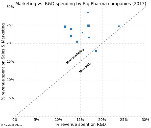
By normalizing the expenditures, the graph now tells a more complete story: We can meaningfully compare the Big Pharma companies and see that most of them spend about 15% of their revenues on R&D and 20-25% of their revenues on marketing, with Roche and Eli Lilly & Co. being the odd ones out sitting on the line of parity.
Provide meaningful context
Perhaps the most egregious oversight in the design of the original bubble chart was the failure to provide any meaningful context to the data. The viewer was left with the fact that "9 out of 10 Big Pharma companies spend more on marketing than R&D," but many viewers don't know if a large marketing budget is normal for a company or not. Left to their own devices, many viewers (especially those who watched John Oliver exposé) assumed "R&D good, marketing BAD" and immediately grabbed their pitchforks and aimed them at Big Pharma.
To provide at least some context to the data, I looked up the 2013 marketing and R&D budgets of 6 large companies and plotted them alongside the Big Pharma companies. The companies are:
- Samsung
- Intel
- Microsoft
- Toyota
- General Motors
These companies were picked based on the ease of looking up their budget and revenue information. Unsurprisingly, not all companies make this information readily accessible on the internet.
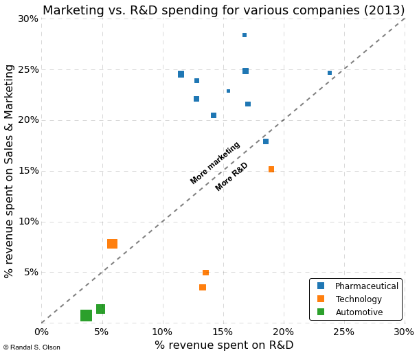
At least based on the companies chosen, it appears that Big Pharma as a whole is an outlier when it comes to marketing budgets. Even Samsung with its infamous $14bn marketing budget only spends ~8% of its revenues on marketing. The only company that even comes close to Big Pharma in terms of marketing is Intel, but it still spends more on R&D than marketing.
Perhaps the pitchforks over Big Pharma's apparently overgrown marketing budget were warranted, but we didn't know until at least some context was provided.
Conclusions
Well-designed data visualizations are one of the most effective mediums for communicating information today. We must be careful when designing visualizations to make sure that they tell the whole truth rather than bend statistics to tell the story we want to hear. In this critique, I have covered 3 common oversights that lead to bad and/or misleading visualizations:
- Selection of a proper chart
- Normalizing data
- Providing meaningful context
Before sharing your visualizations in the future, please be sure to review your work to ensure that you didn't hit one of these common pitfalls.
If you liked what you saw in this post and want to learn more, check out my Python data visualization video course that I made in collaboration with O'Reilly. In just one hour, I will cover these topics and much more, which will provide you with a strong starting point for your career in data visualization.

Dr. Randal S. Olson
AI Researcher & Builder · Co-Founder & CTO at Goodeye Labs
I turn ambitious AI ideas into business wins, bridging the gap between technical promise and real-world impact.


