Americans eat 3x more cheese and half as much milk as they did in 1970
Part of Teaching an AI Agent to Make Beautiful Charts
The USDA has been tracking what Americans eat since 1909. I pointed an AI agent at their Food Availability Per Capita Data System to see what changed since 1970, and the answer is: almost everything.
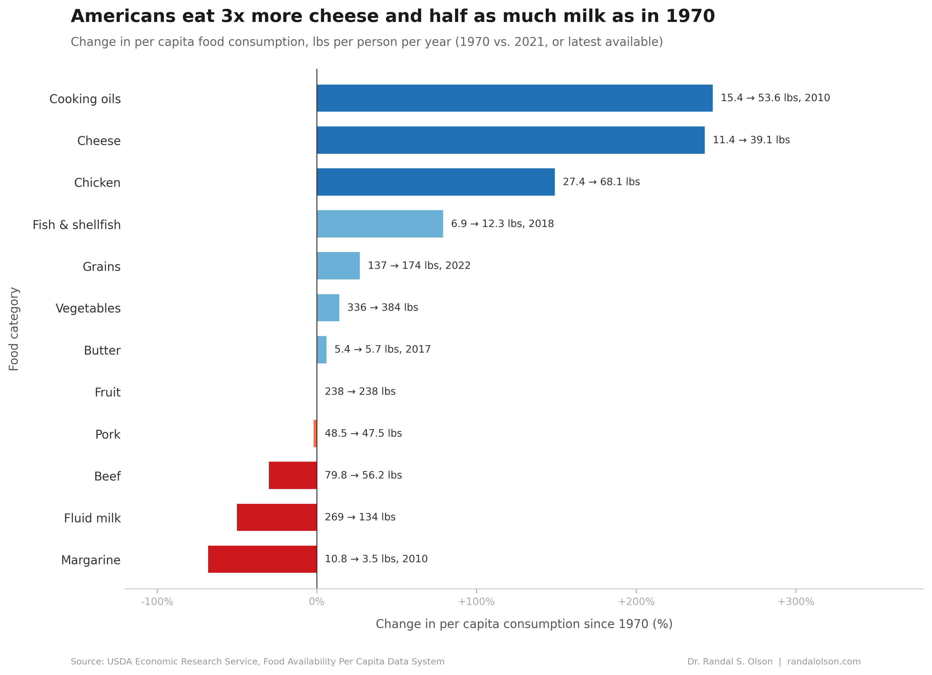
Americans ditched their milk and tripled their cheese
Fluid milk consumption was cut in half, from 269 to 134 pounds per person. Cheese tripled, from 11 to 39 pounds. A USDA study found that the milk decline is about fewer drinking occasions, not smaller glasses. Americans just stopped pouring milk at lunch and dinner. Sodas, bottled water, and eventually plant-based milks took its place.
Total dairy consumption actually went up over this period. The dairy industry shifted production toward cheese, where margins are better and the product lasts longer on shelves. The USDA credits the explosion of Italian and Tex-Mex cuisines, frozen pizza, and pre-shredded bags for the demand side. Italian cheese varieties alone went from 2.1 pounds per person in 1970 to nearly 15 pounds by 2012. Not shown on the chart: yogurt rose 1,627%, from under 1 pound per person to 14.3, mostly on the back of the Greek yogurt boom in the late 2000s.
Chicken overtook beef in 2010
Chicken more than doubled, from 27 to 68 pounds per person. Beef dropped 30%, from 80 to 56 pounds. According to USDA analysis, three things drove the swap: price (chicken ran $1.67 to $2.64 cheaper per pound at wholesale and retail in 2010), convenience products like boneless breasts and rotisserie chicken, and health concerns about saturated fat. Production got more efficient too. The average broiler weighed 5.8 pounds by 2010, up from 3.4 in 1960.
Pork barely moved. 48 pounds per person in 1970, 47 in 2021. It's the most stable major protein in the American diet.
Cooking oils nearly quadrupled
Salad and cooking oil consumption went from 15 to 54 pounds per person. The food industry moved away from animal fats (lard and tallow) toward vegetable oils, especially soybean oil. Health guidance in the 1980s and 1990s pushed consumers toward unsaturated fats, and the growth of restaurant and processed food drove commercial demand. By 2010, cooking oils made up the largest share of added fats in the American diet.
Margarine collapsed, butter held steady
Margarine fell 68%, from nearly 11 pounds per person to 3.5. Research in the 1990s linked the trans fats in partially hydrogenated oils to heart disease, and consumers bailed. A USDA retrospective notes that butter overtook margarine again around 2005, despite costing nearly four times as much. The FDA's 2018 ban on partially hydrogenated oils finished the job.
Butter itself held flat at 5.4 to 5.7 pounds per person. The "butter is back" story is really a "margarine left" story.
Vegetables peaked in 2000 and have been sliding
Total vegetable availability peaked at 425 pounds per person around 2000, then fell to 384 by 2021. The biggest single driver is potatoes. Per capita potato availability dropped 28 pounds as Americans ate fewer fries and baked potatoes. Canned and frozen vegetables also declined steadily, down 32 pounds since the mid-1990s. Fresh vegetables are the exception, rising modestly even as the total fell.
How this chart was made
An AI agent built this chart end-to-end as part of the Beautiful Charts with AI series. It downloaded USDA data files, verified the key stories, and iterated on the design until it passed the Tufte Test, a data visualization quality standard built by Goodeye Labs on Truesight.
Data source: USDA Economic Research Service, Food Availability Per Capita Data System. It tracks food availability rather than direct observed intake, so it's best read as a long-run proxy for consumption. Covers 200+ commodities from 1909 to 2021 (varies by category). The cleaned dataset is available here.
Beautiful Charts with AI
Want to test your own charts against the same quality bar?
Try the Tufte Test on your own chart, or get future updates on AI evaluation and chart quality from Goodeye Labs.

Dr. Randal S. Olson
AI Researcher & Builder · Co-Founder & CTO at Goodeye Labs
I turn ambitious AI ideas into business wins, bridging the gap between technical promise and real-world impact.