Where racial diversity lives in America, county by county
Part of Teaching an AI Agent to Make Beautiful Charts
Back in 2014, I mapped racial diversity for every U.S. county using 2010 Census data. That map got a lot of traction on Reddit, and the question people kept asking was: how does this look with newer data? The 2020 Census has been out for a while now, so I pointed an AI agent at it and told it to build an updated map.
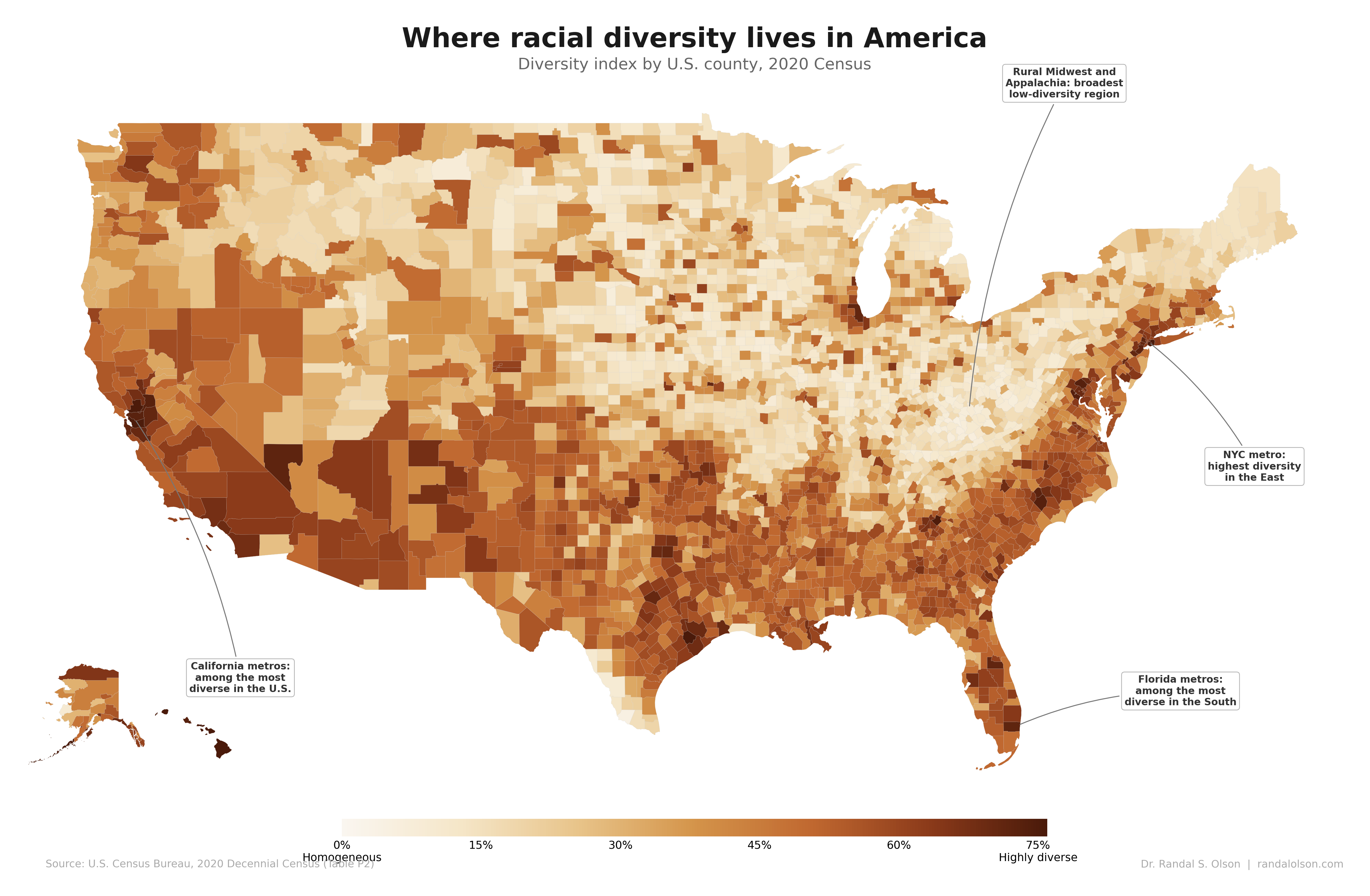
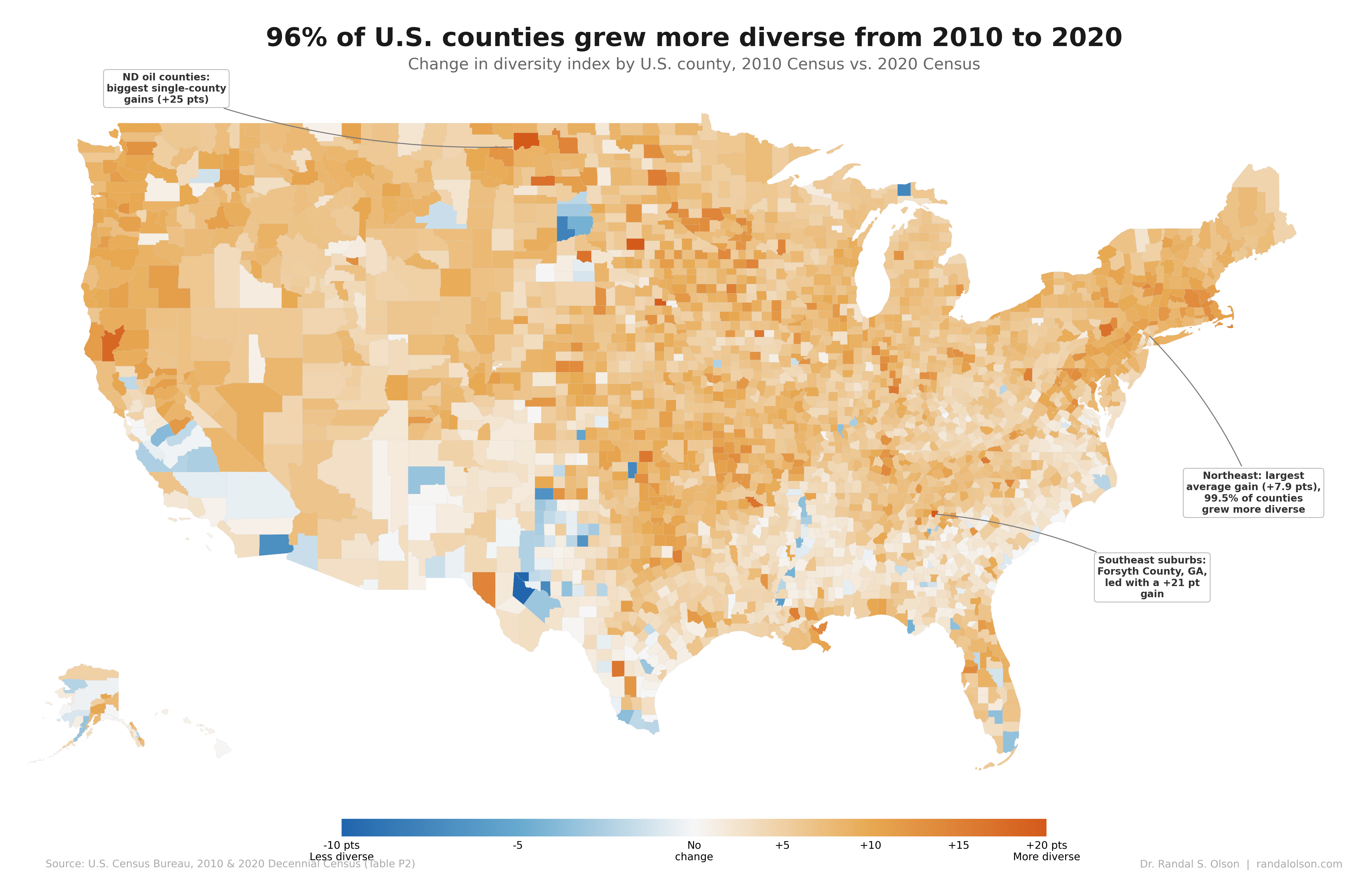
The map shows the Census Bureau's Diversity Index for all 3,143 counties and county equivalents in the 50 states and D.C.: the probability that two people picked at random belong to different racial or ethnic groups. Zero means everyone is the same race. The national index hit 61% in 2020, up from 55% in 2010. But the median county sits at just 33%. Most Americans live in diverse places; most places in America are not diverse. If you want the before-and-after view, I also mapped where diversity changed fastest from 2010 to 2020.
California metros lead the mainland in diversity
The darkest clusters on the mainland are California's major metro areas. Alameda County (Oakland) scores 75%, Sacramento 73%, San Francisco 70%. What these counties have in common is a genuine four-way mix: large White, Hispanic, Asian, and Black populations all in one place. Hawaii tops the country at 76% statewide, driven by its mix of Asian, White, Native Hawaiian, and multiracial residents.
Texas has one county in the same league: Fort Bend, outside Houston, scores 76%, the highest in the state. It works for the same reason California's metros do. No single group dominates, and large White, Hispanic, Black, and Asian populations all live in the same county.
The NYC metro is the most diverse region in the East
Queens County scores 77% on the diversity index, the most diverse large county in the eastern United States. Brooklyn hits 75%. The dark patch extends across northern New Jersey (Essex, Hudson, and Middlesex counties all above 70%) and into the Maryland suburbs of D.C. (Montgomery County at 74%). This is where immigration from dozens of countries concentrates in dense, mixed neighborhoods.
Look at the map and you can see the pattern: every major metro area pops against its surroundings. The Twin Cities stand out against a pale Minnesota. Denver against Colorado. Atlanta against Georgia. Immigration, jobs, and universities all pull people to the same places.
The rural Midwest and Appalachia form the broadest low-diversity region
The lightest band on the map stretches from West Virginia through Kentucky, across Iowa and Indiana, and up into the Dakotas. Kentucky has 51 counties below 15% on the diversity index. West Virginia has 36 out of 55. Iowa has 46 out of 99. These are places that largely missed both big immigration waves and the main destinations of the Great Migration.
The exceptions pop on the map: meatpacking towns in Iowa and Nebraska that attracted Hispanic workers, and university counties with international students. But away from the coasts and major metros, the center of the country remains overwhelmingly White.
Florida metros show how far the pattern has spread
Florida gives the South another dark patch on the map, but the bigger story is how common highly diverse metro counties have become outside the old coastal gateways. Broward County scores 72%, the highest in Florida. Orange County, home to Orlando, is right behind at 71%. Fort Bend outside Houston hits 76%, Gwinnett outside Atlanta 75%, and Prince William outside Washington 74%.
Brookings found the same pattern in the 2020 Census: America's big suburbs are now often more diverse than the country as a whole. Miami-Dade shows why the details matter. It feels like the kind of place that should top the chart, but the county's population is less evenly split than Broward's or Orange's. Hispanics make up 69% of residents there, so its diversity index lands at 49%. The index rewards balance across big groups, not just a place drawing people from everywhere.
How this chart was made
An AI agent built this chart end-to-end as part of the Beautiful Charts with AI series. It pulled 2020 Census data via the Census Bureau API, computed the Gini-Simpson diversity index for all 3,143 counties and county equivalents in the 50 states and D.C., and iterated on the design until it passed the Tufte Test, a data visualization quality standard built by Goodeye Labs on Truesight.
Data source: U.S. Census Bureau, 2020 Decennial Census, Table P2 (Hispanic or Latino, and Not Hispanic or Latino by Race). The cleaned dataset with diversity index scores for all counties is available here.
Beautiful Charts with AI
Want to test your own charts against the same quality bar?
Try the Tufte Test on your own chart, or get future updates on AI evaluation and chart quality from Goodeye Labs.

Dr. Randal S. Olson
AI Researcher & Builder · Co-Founder & CTO at Goodeye Labs
I turn ambitious AI ideas into business wins, bridging the gap between technical promise and real-world impact.