96% of U.S. counties grew more diverse from 2010 to 2020
Part of Teaching an AI Agent to Make Beautiful Charts
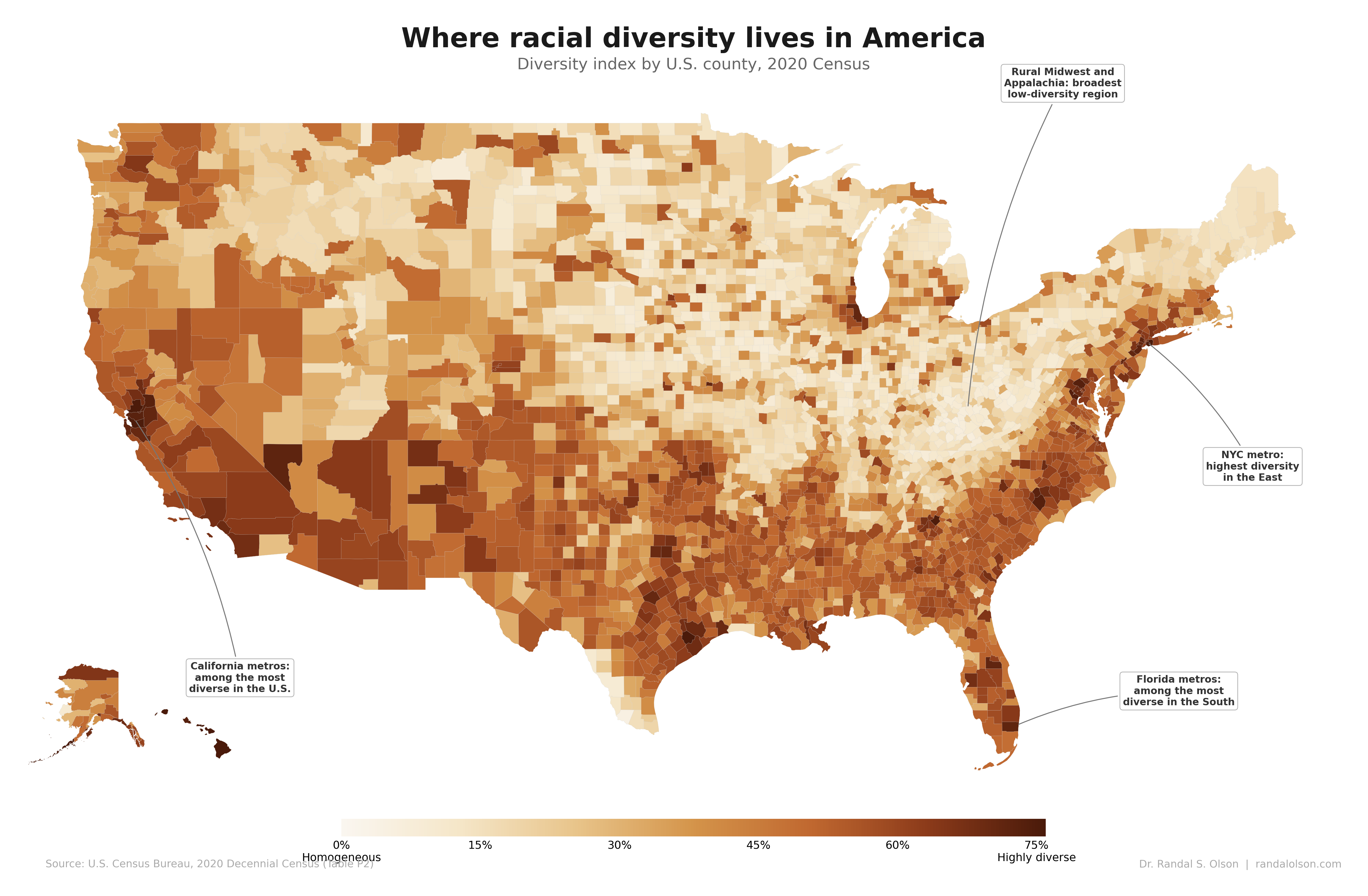
In the companion post, I mapped where racial diversity lives in America today. This post answers the follow-up question: where is it changing fastest? I had an AI agent compute the diversity index for every matched county and county equivalent in the 50 states and D.C. in both the 2010 and 2020 Census, then map the difference.
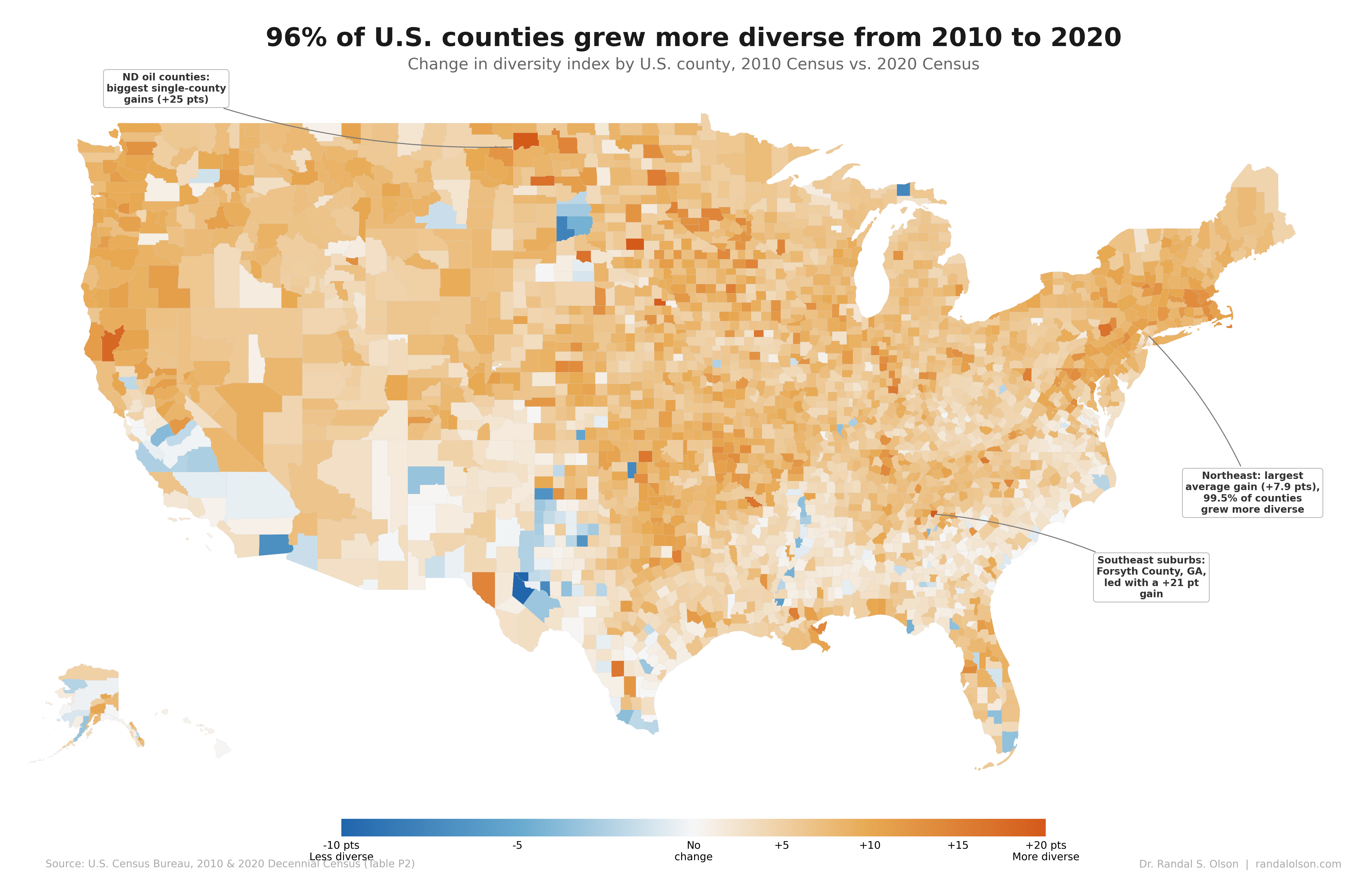
Orange means a county grew more diverse; blue means less diverse. The map is almost entirely orange. Out of 3,139 matched counties and county equivalents, 3,020 (96.2%) grew more diverse over the decade, gaining 5.9 points on average. Only 119 moved in the other direction.
The Northeast posted the largest average gains
Northeast counties gained an average of 7.9 points on the diversity index, with 99.5% of them trending more diverse. No other region was this consistently orange. Suburban counties outside New York, Philadelphia, and Boston absorbed immigration from Asia and Latin America that had previously concentrated in the cities.
Luzerne County, Pennsylvania (Wilkes-Barre) gained 17 points. Its Hispanic population went from about 21,000 residents in 2010 to about 47,000 in 2020. Similar shifts played out across dozens of mid-sized counties in Pennsylvania, New Jersey, and Connecticut.
North Dakota oil counties had the biggest single-county gains
Williams County, North Dakota (Williston) gained 25 points on the diversity index, the single biggest increase in the country. The Bakken oil boom drew workers from across the country, nearly doubling the county's population from 22,000 to 41,000 in a single decade. Neighboring Stark County gained 17 points for the same reason.
The Midwest as a whole gained 6.9 points on average, with 98.9% of counties growing more diverse. Beyond the oil patch, Hispanic immigration to meatpacking towns was the clearest driver. Pew Research found that 214 Midwest counties had Hispanic population growth of 50% or more between 2010 and 2020, concentrated around food processing and agriculture jobs.
Southeast suburbs around Atlanta, Charlotte, and Nashville surged
Forsyth County, Georgia, north of Atlanta, gained 21 points on the diversity index. Its Asian population more than quadrupled, from about 11,000 residents to 45,000, and reached 18% of the county by 2020. The county as a whole grew 43% in a decade. Cabarrus County outside Charlotte and Rutherford County outside Nashville each gained 14 points.
The pattern is simple: where jobs and housing are being built, people from different backgrounds move in. The South overall gained a more modest 4.9 points on average, dragged down by slow-changing rural counties in Appalachia and the Deep South.
The blue counties are the exception, not the story
The blue counties do not add up to a separate national trend. There are only 119 of them, and most are places where one group already dominated and then pulled a little farther ahead. Texas had the most, 39 out of 254 counties. Starr County went from 95.7% Hispanic in 2010 to 97.7% in 2020, and Imperial County in California went from 80% Hispanic to 85%. On this map, "less diverse" usually just means the local mix became a little less even.
Why did this happen nationwide?
Three things happened at once. The non-Hispanic White population declined by 5.1 million, the first such drop in U.S. history, as deaths outpaced births in an aging population. Meanwhile, the Hispanic population grew by 11.2 million and the Asian population by 5.2 million, together accounting for nearly all national growth. And the multiracial population jumped from 9 million to 33.8 million, though much of that reflects changes in how the Census Bureau processed responses rather than actual demographic shifts.
Add it up, and in nearly every county in America, the direction is the same.
How this chart was made
An AI agent built this chart end-to-end as part of the Beautiful Charts with AI series. It pulled both 2010 and 2020 Census data via the Census Bureau API, computed the diversity index change for all 3,139 matched counties and county equivalents in the 50 states and D.C., and iterated on the design until it passed the Tufte Test, a data visualization quality standard built by Goodeye Labs on Truesight.
Data source: U.S. Census Bureau, 2010 & 2020 Decennial Census, Table P2 (Hispanic or Latino, and Not Hispanic or Latino by Race). The cleaned dataset with diversity index scores and change values for all counties is available here.
Beautiful Charts with AI
Want to test your own charts against the same quality bar?
Try the Tufte Test on your own chart, or get future updates on AI evaluation and chart quality from Goodeye Labs.

Dr. Randal S. Olson
AI Researcher & Builder · Co-Founder & CTO at Goodeye Labs
I turn ambitious AI ideas into business wins, bridging the gap between technical promise and real-world impact.