The countries that work the most hours produce the least per hour
Part of Teaching an AI Agent to Make Beautiful Charts
The average worker in Germany puts in about 1,330 hours a year, fewer than in any country the OECD tracks. The average worker in Mexico puts in about 2,200, near the top of the list and roughly 2/3 more time on the job. Common sense says the country logging all those extra hours should be out front. It is not even close, and it runs the other way: a German hour of work generates about $98 of output, a Mexican hour about $25. About 1/4 as much, in exchange for all that extra time.
Germany and Mexico are not a fluke. Put all 40 OECD economies on the same axes, hours worked against output per hour, and the whole field leans the same way. The longer a country works, the less it tends to get out of each hour.
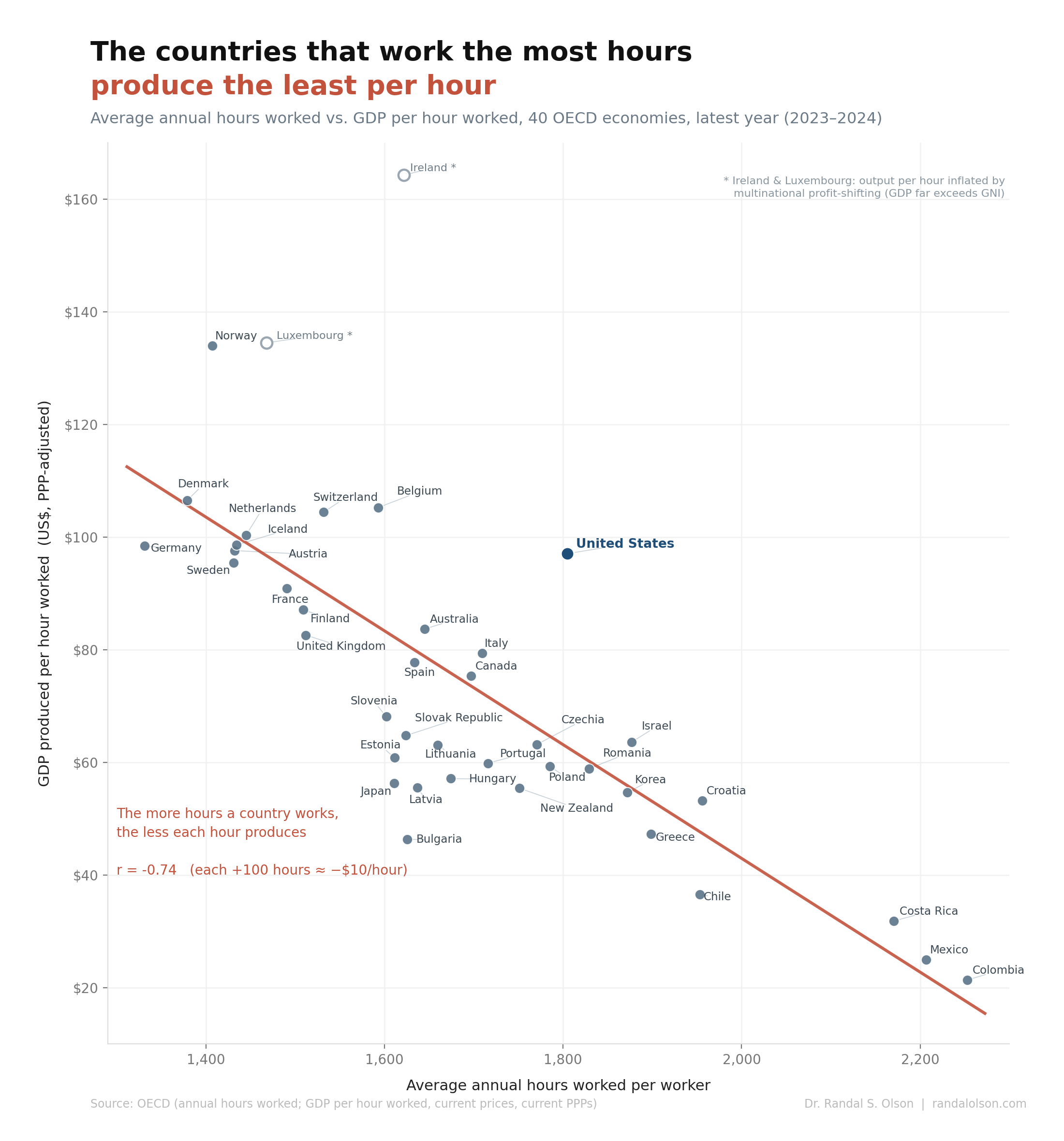
More hours, less output per hour
The slope is steep and the fit is tight, a correlation of -0.74. Every extra 100 hours a country works in a year lines up with about $10 less output per hour. The cleanest version of the story lives at the extremes: Germany, Denmark, Norway, and the Netherlands sit in the top-left with short hours and high output, while Mexico, Colombia, and Costa Rica anchor the bottom-right with the longest hours and the lowest.
One reason hours fail to buy output is that hours are not a clean input. They hit diminishing returns, and the dropoff is sharper than most people assume. Stanford economist John Pencavel went through the output records of First World War munitions workers and found that productivity per hour holds steady up to about 48 hours a week, then falls off a cliff. Past 56 hours, extra time bought almost nothing: a 70-hour week produced about as much as a 56-hour one. The back half of a long week is already low-yield before capital or technology enters the picture. Hours run into diminishing returns, and economies hit that wall long before they stop piling on hours.
Where people work least and produce most
The short-hours cluster did not get there by slacking off. The Netherlands has the highest rate of part-time work in the OECD, with close to 1/2 of working Dutch women in part-time roles, which pulls the average hours per worker down while output per hour stays near $100. Germany works the fewest hours of anyone, and that is negotiated, not accidental. Sectoral union contracts set the workweek below the legal ceiling, and in 2018 IG Metall won workers the right to drop to a 28-hour week for up to 2 years.
What lets these countries work less and still produce more is what each hour has to work with: machinery, software, mature processes, decades of accumulated capital. The output comes from the system, not the stopwatch. They broke the link between hours and output, and took part of the winnings as time off.
Where people work most and produce least
At the other end, long hours are usually a sign of how much an economy still runs on people instead of capital. More than 1/2 of all jobs in Mexico and Colombia are informal, much of it self-employment in small operations where you put in long days for thin margins. The structural gap is enormous: capital per worker in Latin America is about 1/3 of the level in the United States and the OECD, and the region has lost ground, sliding from 46% of the OECD's output per worker in 1990 to 37% in 2023.
This is not only a developing-economy story. Greece works the longest hours in the European Union and still lands near the floor of this chart, for the same structural reasons: lots of small firms, heavy self-employment, and labor-intensive work in tourism and agriculture. Here, long hours are a symptom of low productivity, not a cure for it.
The United States breaks the pattern
One big economy sits stubbornly above the line: the United States. It works long hours, about 1,805 a year, more than any wealthy Western European country, and still produces about $97 per hour, near the top of the table. That is the exact combination the rest of the chart says should not exist.
Part of it is real. U.S. output per hour rides on heavy investment in information technology and intangible capital, which is why the U.S. number is not the accounting illusion Ireland's turns out to be. Part of it is just more time on the clock. The U.S. is the only advanced economy with no federally guaranteed paid vacation or holidays, while the EU mandates at least 4 weeks. The sharpest way to see it is the U.S. against Germany. A U.S. worker puts in about 474 more hours a year, nearly 12 extra 40-hour weeks, and at the end of all of it produces slightly less per hour than the German who clocked out earlier. The U.S. buys its high output with a blend of real productivity and a pile of extra hours nobody requires it to give back.
The top of the chart deserves a second look
The dots floating highest all come with an asterisk, for different reasons. Ireland tops the chart at $164 an hour, but that figure is mostly bookkeeping. In 2015 Irish GDP jumped 26% in a single year, not because the country got 1/4 more productive overnight but because multinationals shifted intellectual property onto Irish books. The distortion was blatant enough that Ireland's own statisticians built a separate measure, modified gross national income, to scrub it out. By that cleaner gauge, the real economy is something like 40% smaller than headline GDP suggests.
Luxembourg, just below it at about $134 an hour, has a different quirk. Close to 1/2 of its workforce commutes in from France, Belgium, and Germany every day. Their output counts toward Luxembourg's GDP, but they are not part of its resident workforce, so output per worker comes out inflated.
Norway, essentially tied with Luxembourg near the top, is the most honest of the three, and still worth a caveat. Its number is not an accounting illusion; the output is real. But a big share of it comes from oil and gas, Norway's largest sector by value added and exports. That output flows from offshore rigs run by relatively few people, which lifts the national figure without saying much about a typical Norwegian's workday. Strip out petroleum and mainland Norway, where most Norwegians actually work, looks a good deal more ordinary. The highest dots all need context: two are accounting, the third is oil.
What this chart can and cannot say
The tempting read is a life hack: work less, produce more. The chart does not say that, and dressing it up that way would be the dishonest version. The cleaner explanation runs the other direction. Rich, high-productivity countries can afford to work less, so as incomes climb people buy back their time through shorter weeks and longer vacations, while poorer economies put in long hours out of necessity. The causation runs both ways at once, and national income is doing most of the work behind the slope.
There is a measurement quirk worth naming, since the y-axis has hours sitting in its denominator. GDP per hour is output divided by hours worked, so plotting it against hours carries a built-in downward tilt. That is not what drives the picture, though. The same negative pattern shows up against GDP per capita, which has no hours in it at all, and output per worker varies far more across these countries than their hours do. The tilt is real, not an accident of the math.
One more honest flag: the OECD warns that its annual-hours figures are not built for comparing the exact level of hours between countries in a single year, partly because the measure folds in the self-employed, who tend to report long days. So some of the spread at the bottom of the chart comes from how the data is collected, not from people truly working more. This is not a productivity tip. It is a picture of how wealth, economic structure, and even the act of measurement all happen to point the same way.
How this chart was made
An AI agent built this chart end-to-end as part of the Beautiful Charts with AI series. It pulled average annual hours worked and GDP per hour worked for 40 economies directly from the OECD, matched each country to the latest year both series were available (2023 or 2024), fit the relationship, and labeled every country. The design iterated until it passed the Tufte Test, a data visualization quality standard from Goodeye Labs. The workflow behind it is public: run the same high-signal chart workflow to make your own.
Data sources: OECD average annual hours actually worked per worker and GDP per hour worked (current prices, current PPPs). The full dataset used for this chart is available here.
Beautiful Charts with AI
Make your own charts with the same workflow
Every chart in this series is built by the same public workflow. Fork it and run it yourself, then grade the result against the Tufte Test.

Dr. Randal S. Olson
AI Researcher & Builder · Co-Founder & CTO at Goodeye Labs
I’ve worked in AI for 15+ years. At Goodeye Labs, we build AI products that point frontier models at the business outcomes a team actually cares about.