The evolution of chess openings and why GIFs make for bad data visualizations
Earlier this year, I went on a week-long data analysis frenzy into a massive data set of chess tournament games. One of the better visualizations that came out of that post series was the evolution of openings over time set, where I looked at the popularity of various chess openings from 1850 through 2014.
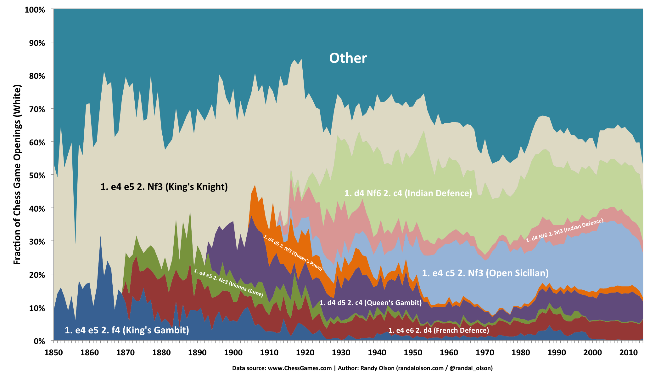
However, once I tried to visualize up through the 4th move, I found it too difficult to use area charts any more. Instead, I turned to a GIF (or, well, a video-GIF):
In retrospect, this video visualization is worthless for communicating how chess openings have changed over time. By watching the video, the only bit of information the viewer can possibly hope to glean is that some openings have dropped in popularity, and the openings have become more diverse over time.
Most data visualizations take considerable cognitive resources to comprehend. The critical failure of this visualization is that on top of the typical cognitive resources required to interpret it, it also requires the viewer to remember what the graph looked like 5, 10, or even 30 seconds ago to make any sort of meaningful comparison. This requirement will undoubtedly lead to cognitive overload for the viewer, which ultimately renders the visualization unusable.
In short: To make a better data visualization, show all of the important data at once. Don't require the viewer to remember parts of the graph from several seconds ago when making comparisons because it simply won't work.
To illustrate this concept, I remade the graph as a stacked area chart in d3.js. I had to use smoothing to make the chart look reasonably presentable.
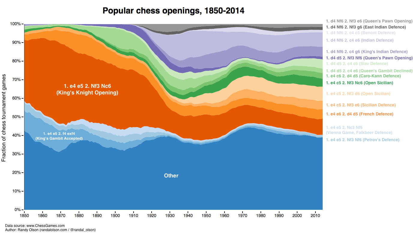
Interactive version
Once you're done looking through this visualization, go back to the video. Do you see any trends that you never saw before in the video? Is it easier to compare time points in this area chart than with the video? Keep these insights in mind the next time you consider using a GIF or video to visualize a time series.
You can find the entire chess analysis series here:

Dr. Randal S. Olson
AI Researcher & Builder · Co-Founder & CTO at Goodeye Labs
I turn ambitious AI ideas into business wins, bridging the gap between technical promise and real-world impact.