The Misery Index Stopped Predicting the National Mood
Part of Teaching an AI Agent to Make Beautiful Charts
Unemployment is near 4.3%. Inflation has cooled back under 4%. Add those together and you get the misery index, the back-of-the-envelope gauge of economic pain that has been around since the 1970s, sitting around 8%. That is an ordinary number. It is roughly where the misery index sat during the mid-2000s expansion.
So why is the mood so dark? The University of Michigan's April 2026 final reading was 49.8, and the preliminary May 2026 number fell again to 48.2, the lowest reading on record. Lower than the depths of 2008. Lower than 1980, the worst the misery index has ever been. The economy looks unremarkable and the public feels worse than it did during the worst downturns on record. For 40 years, you did not see both at once.
A 40-year relationship
Economist Arthur Okun built the misery index in the 1970s as a quick read on how much the economy hurts: just the unemployment rate plus the inflation rate. Consumer sentiment is the other half of the picture, a monthly survey of how households say they feel about their money and the economy. The index is pinned to 100 at its strong-economy 1966 benchmark; its long-run average is around 85, and readings in the 50s show up only in crises like 1980 and 2008.
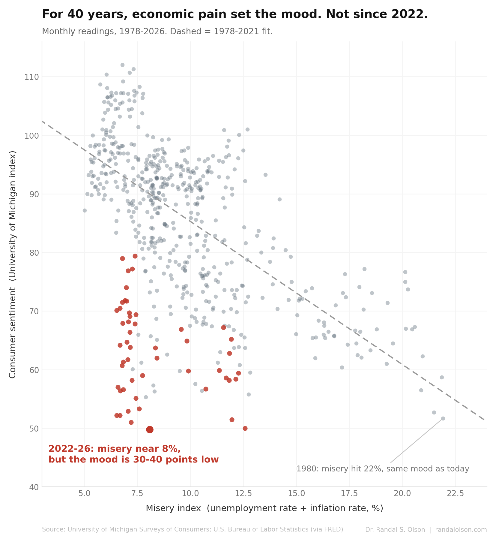
From 1978 to 2021 sentiment and the misery index tracked each other. The relationship was loose, not a law (the misery index explains only about 40% of the month-to-month swings in sentiment, so the gray cloud is wide), but it always pulled the same direction. When the economy hurt, the mood sank with it, through the early-1980s inflation, the early-1990s recession, the 2008 crash. For 4 decades you could not be this gloomy without a painful economy to match.
Then the dots fell off the line
The red points are 2022 through 2026, with the slide starting in late 2021. They sit at a misery index near 8%, the same range as the calm years, but 30 to 40 points lower on sentiment than that range ever produced before. In plain statistical terms, recent months land 2 to 4 standard deviations below the historical fit and have stayed there for years.
1980 makes the size of it concrete. That May the misery index hit 22%, inflation running near 14% on top of a 7%-plus jobless rate, and sentiment bottomed near 52. Today the misery index is roughly 8% and sentiment is about the same. The public feels as grim as it did in the worst economy on record, with about a third of the economic pain.
The 2008 financial crisis is the one prior moment the mood fell as far below the misery index as it has now, when the shock to confidence outran the rise in unemployment and inflation. But that lasted a few quarters and closed within a year. The post-2021 detachment has held for 4 straight years, and it is the first time the relationship itself, not just the level, stopped holding. This is not the mood overshooting a still-working relationship. The relationship stopped describing the data.
It is not a partisan story
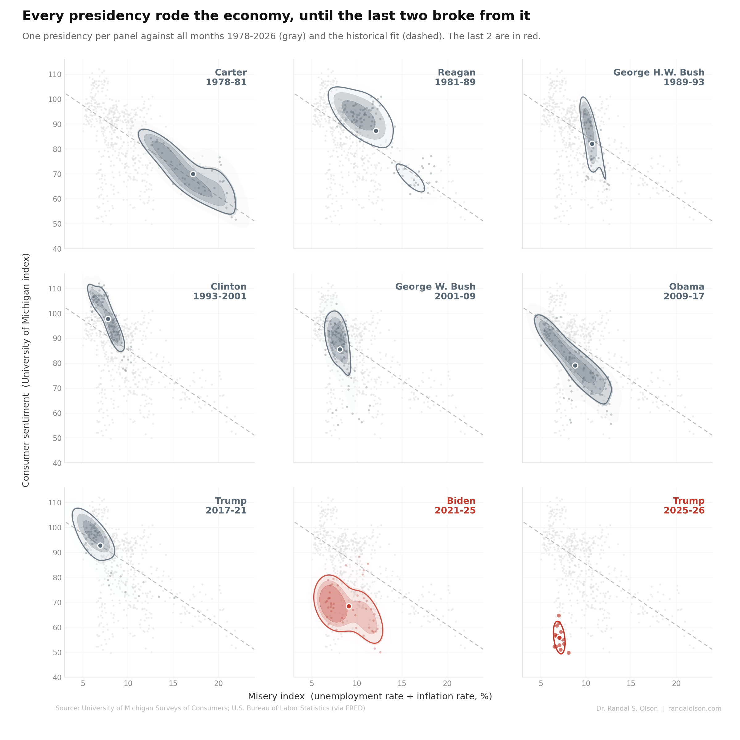
The obvious suspicion is that this is just partisans trashing the economy when the other side holds the White House. The presidencies say otherwise. Trump's first term sits squarely on the historical line, including the 2020 pandemic spike, when unemployment surged and the mood fell exactly as the old relationship predicts. The break shows up under Biden and continues under Trump's second term: a Democratic administration and a Republican one, the same detachment.
Partisanship does widen the spread. A Brookings analysis attributes roughly 3.6 points of the depressed reading to partisan bias, with Republicans about 2.5 times more reactive than Democrats. But widening the spread is not the same as moving the average. If this were partisan grievance, the mood would flip with the party in power. It hasn't.
So what broke?
Economists call this the "vibecession." The tidy guess is that people are reacting to high prices, and there is something to it, though not in the way the misery index measures. The misery index uses the inflation rate, the change in prices over the past year, which has cooled. Households are looking at the price level, which has not: prices are about 27% higher than they were at the start of 2020 and are not coming back down. Surveys back this up. Brookings, drawing on work by Stefanie Stantcheva, finds people report perceived inflation around 7.1% against an actual rate near 3.4%, because they are pricing the cumulative jump, not the latest year.
That said, no single replacement number cleanly stands in for the misery index here, and a chart that claimed one would be overfitting a vibe. The honest summary is narrower and more interesting: the most durable rule of thumb in popular economics quietly stopped working, and the mood is now anchored to how prices feel rather than to the textbook gauge of pain. A Federal Reserve study of verified retail purchases sharpens the puzzle: 43% of people said they were doing worse than in 2019 while actually buying more.
An honest caveat
The survey itself changed. The University of Michigan moved from phone to web interviewing in 2024, and the new method reads lower, by the university's own estimate around 6.6 points and by an independent estimate about 8.9 points, enough that analysts call it a structural break. It is worth knowing, but it does not rescue the old relationship. The dots had already fallen off the line in 2022 and 2023, before the change, and even crediting the full adjustment leaves recent readings about 3 standard deviations below the historical fit.
How this chart was made
An AI agent built these charts end-to-end as part of the Beautiful Charts with AI series. It pulled the University of Michigan Index of Consumer Sentiment, the unemployment rate, and the Consumer Price Index from FRED, computed the misery index as unemployment plus trailing 12-month inflation, fit the historical relationship on 1978 to 2021 only, and produced 2 figures. Each design iterated until it passed its own chart-quality review.
Data sources: University of Michigan Surveys of Consumers via FRED series UMCSENT; U.S. Bureau of Labor Statistics via UNRATE and CPIAUCSL. The full monthly dataset used for these charts is available here.

Dr. Randal S. Olson
AI Researcher & Builder
I’ve worked in AI for 15+ years, from academic research to production systems at startups. I’m building things independently for now.