CO2 is piling up faster every decade, and 2026 just set a record
Part of Teaching an AI Agent to Make Beautiful Charts
Carbon dioxide is the main driver of climate change. It traps heat, so the more of it in the air, the warmer the planet runs, which is why its concentration is the most closely watched number in climate science. Almost everyone has seen the chart of that number climbing since the 1950s.
But the line is not just going up, it is getting steeper. The air took on more CO2 in the last decade than in any 10-year stretch since record-keeping began in 1959, and this past May the monthly average at Mauna Loa hit 432 parts per million, the highest ever measured.
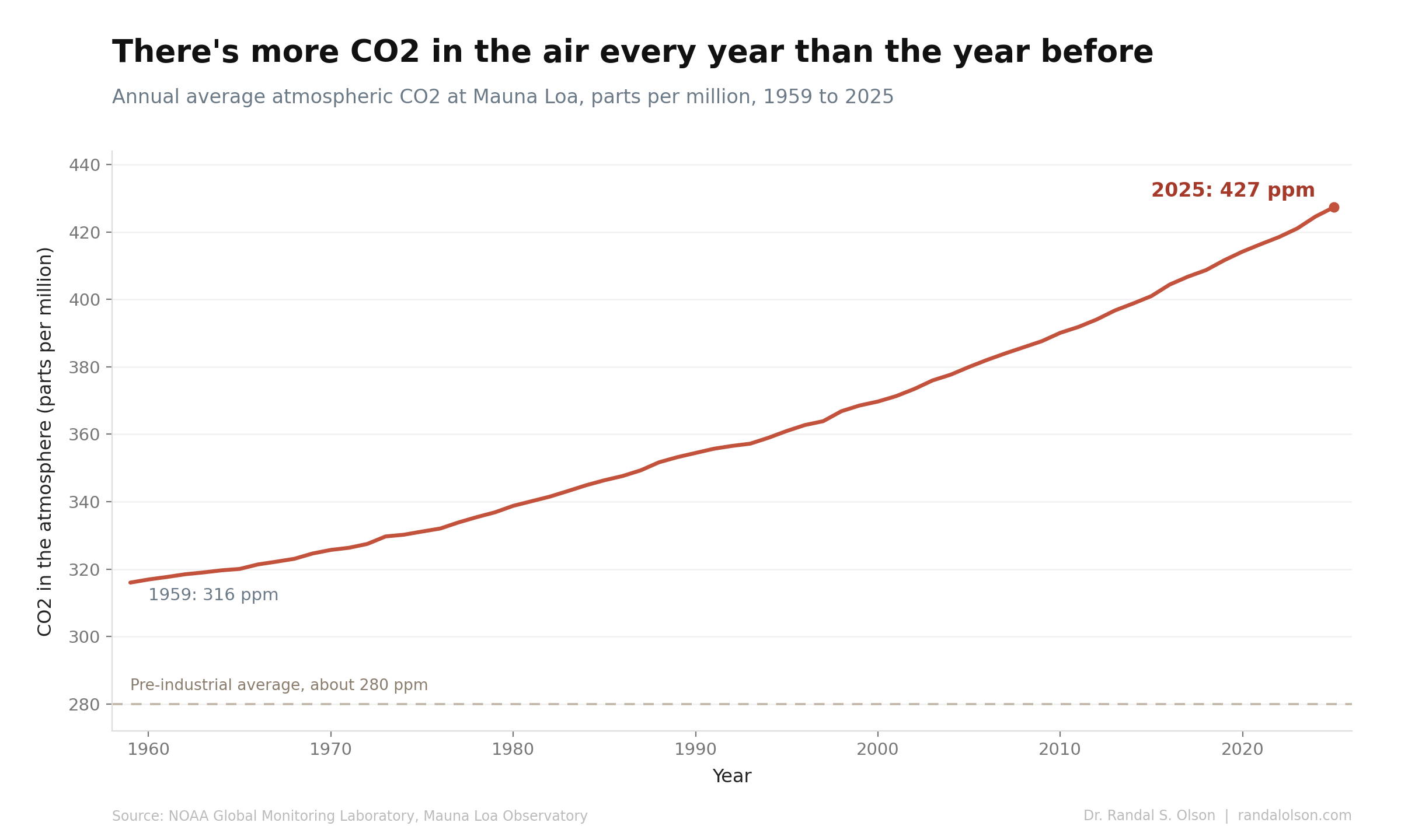
This is the famous Keeling Curve, named for Charles David Keeling, who started the measurements on a Hawaiian volcano in 1958. Each point is the average concentration of CO2 in the air that year. Parts per million is literal: at 432 ppm, 432 of every million molecules of air are CO2. That share sounds trivial, but CO2 traps heat so well that this trace amount helps set the planet's temperature, and pushing it higher pushes the planet warmer.
More CO2 every year than the year before
Every single year since 1959, there has been more CO2 in the air than the year before. The annual average has climbed from 316 ppm in 1959 to 427 ppm in 2025, and the seasonal peak this past May reached 432 ppm. Not one year reversed the trend.
The dashed line marks the pre-industrial level of about 280 ppm, where CO2 sat for thousands of years before we started burning coal and oil. We are now more than 50% above that. Across the 800,000-year ice-core record, CO2 never once climbed past about 300 ppm, according to NOAA. The last time the air held this much carbon dioxide was roughly 3 million years ago, in the mid-Pliocene, when the planet was 2.5 to 4 degrees Celsius warmer and seas were far higher.
The level is only half the story
The pace is the other half, and it hides inside that smooth line, because "how fast CO2 is rising" is a step removed from "how much is up there." Here is the same Mauna Loa data, cut a different way. Each line takes a decade, resets it to zero in its first year, and stacks them on top of each other. A steeper line means CO2 piled on faster that decade.
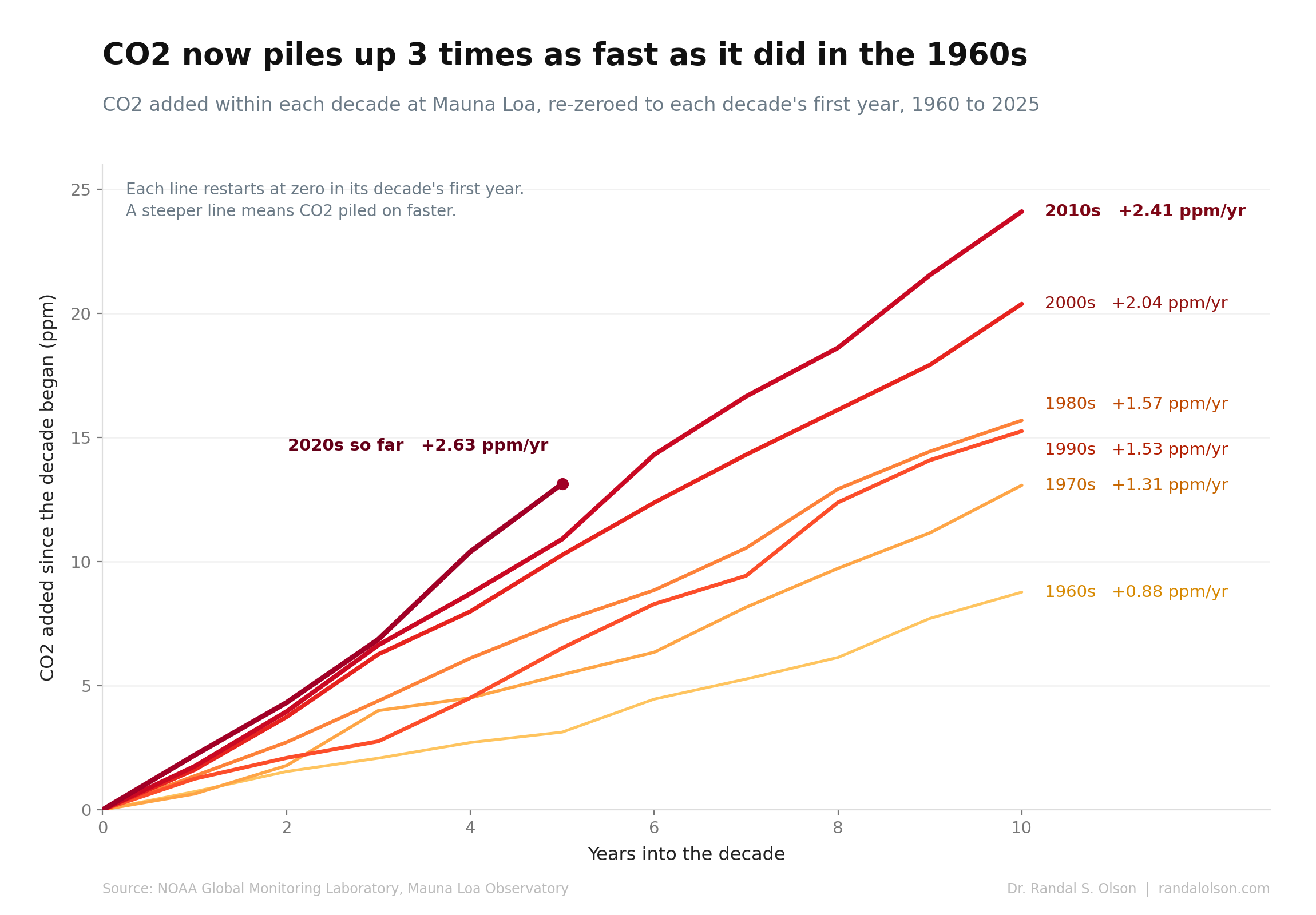
The decades fan out in almost perfect order, slowest at the bottom and steepest at the top. That spread is the acceleration.
Each decade outpaces the last
CO2 now builds up about 3 times faster than it did in the 1960s. Back then the air gained roughly 0.88 ppm a year. The 2010s ran at 2.41 ppm a year, and the 2020s are running hotter still at 2.63. In total, the 2010s added about 24 ppm, more than any other decade on record.
The reason is blunt: we keep emitting more. Global fossil-fuel CO2 emissions hit a record 37.4 billion tonnes in 2024 and rose again, with the Global Carbon Project reporting no sign of a peak. As long as yearly emissions keep setting records, the amount in the air climbs faster and faster.
2024 was the biggest single-year jump on record
From 2023 to 2024, CO2 at Mauna Loa jumped 3.33 ppm, the largest single-year increase in the record, and NOAA's global figure of 3.75 ppm set a record too. Record emissions set the baseline, and the 2023 to 2024 El Nino pushed it higher. Hot, dry conditions across the tropics gutted the land carbon sink, the forests and soils that normally soak up part of what we emit, so more of it stayed in the air. As that El Nino faded, the 2025 increase eased back to 2.23 ppm, still high by any historical standard.
The decade that broke the pattern
The fan has a single hiccup: the 1990s came in a touch slower than the 1980s. That dip traces almost entirely to a single volcano. When Mount Pinatubo erupted in June 1991, it threw enough sulfur into the stratosphere to cool the planet by about 0.5 degrees Celsius, which let forests and oceans pull down extra carbon for a couple of years; the global growth rate briefly fell to around 0.6 ppm in 1992, per research in Geophysical Research Letters. The collapse of the Soviet Union around the same time cut its emissions sharply and helped hold the decade down. Then the climb resumed, faster than before.
The pace is the point
It is tempting to fixate on each new record ppm number, and a fresh one lands almost every May. But the records are a symptom. What matters is that the line keeps bending upward, decade after decade, because we keep adding more carbon than the year before. At the current pace, the Global Carbon Project puts the world on track to blow past the 1.5 degree Celsius warming limit within a few years.
The good news, if there is any, is that this is the most direct dial we have. The slope of that fan is set by how much we emit. Bend emissions down and the lines flatten. Nothing in 67 years of data says that is impossible. It just has not happened yet.
How this chart was made
These charts were built by an AI agent and graded against the Tufte Test, a data visualization quality standard from Goodeye Labs. The workflow behind it is public: run the same high-signal chart workflow to make your own.
Data source: Annual mean and monthly atmospheric CO2 from the NOAA Global Monitoring Laboratory, measured at the Mauna Loa Observatory in Hawaii (record begins 1959). Because of a 2022 eruption at Mauna Loa, NOAA's measurements briefly came from nearby Maunakea between late 2022 and mid-2023. The cleaned annual-average dataset is available here, and the per-decade data behind the second chart is here.
Beautiful Charts with AI
Make your own charts with the same workflow
Every chart in this series is built by the same public workflow. Fork it and run it yourself, then grade the result against the Tufte Test.

Dr. Randal S. Olson
AI Researcher & Builder · Co-Founder & CTO at Goodeye Labs
I’ve worked in AI for 15+ years. At Goodeye Labs, we build AI products that point frontier models at the business outcomes a team actually cares about.